Millennian Ibnu A K
Kenia Visakha Zerlinda
UI/UX Designer
Mentor
July - August 2022
(5 weeks)
Figma, Word
Language learning apps have their own advantages and disadvantages. Some of the advantages that they have are as such:
However, there are more disadvantages to these language learning apps that users have expressed online as such:
“Language learning apps lack what it means to really learn a language such as grammar RULES, sentence STRUCTURES and learning PARTNER. ”
By learning what other language learning app has to offer that has succeeded and failed can we consider which ones should be avoided and implemented.

“Simple and organized interface with GAMIFIED learning system and some NONTEXTBOOK based lessons to avoid boredom.”
Conducting interview and tests for 5 users who have tried learning through a language learning app to know more what they think of their experience using those apps. They were given questions as such:
Bonus question on how respondents prefer their learning method goes:
A) Themed Lesson, a lesson will cover one theme (e.g Introduction, At School), OR
B) Categorized Lesson, a lesson will have the same category (e.g Animals, Fruits)
By using user persona according to how Korean learners are stereotypically, most of them are women in their teens or young adult age and is stanning a K-Pop group. They want to get to know more of their idols’ activity so they are moved to start learning Korean.
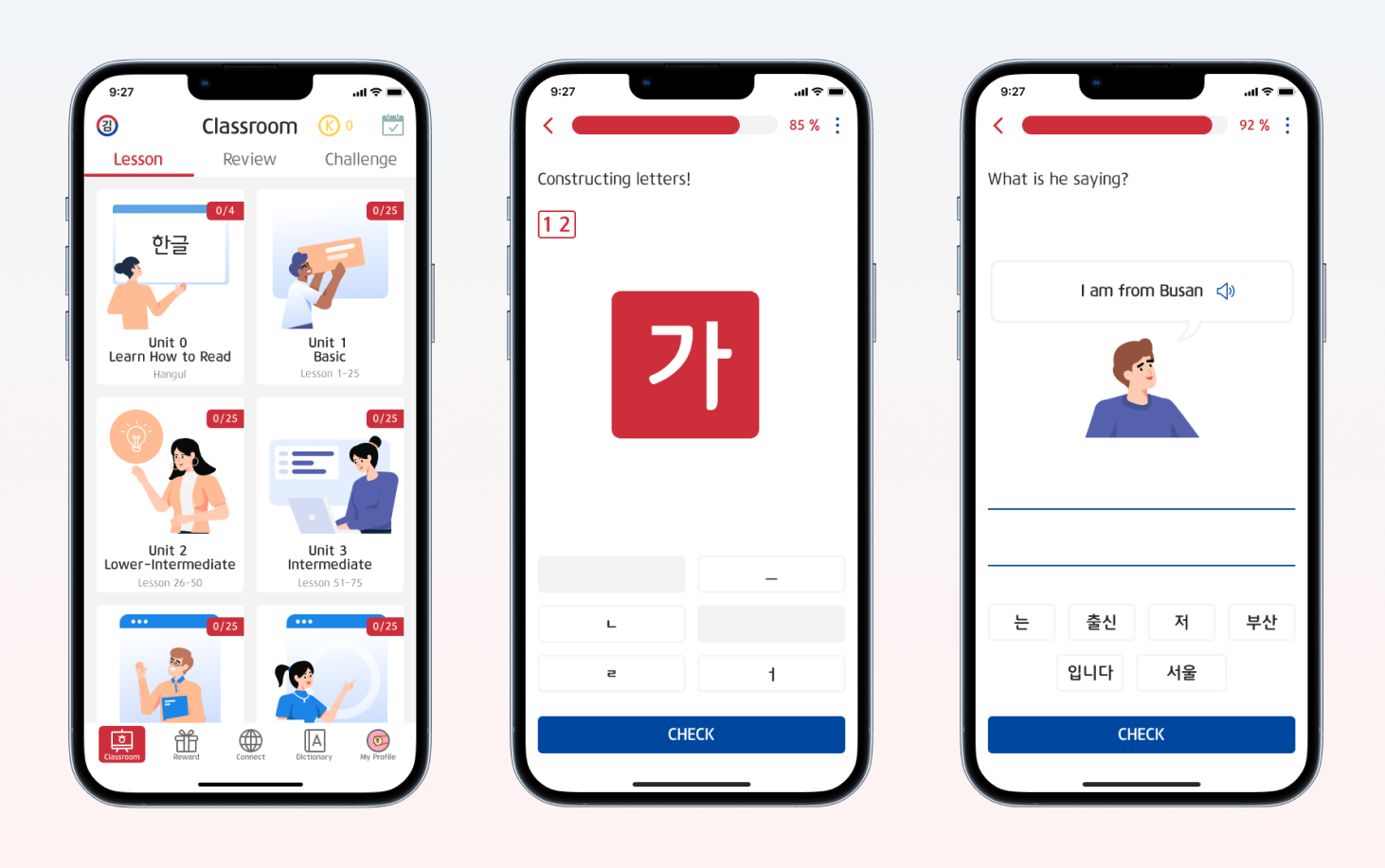
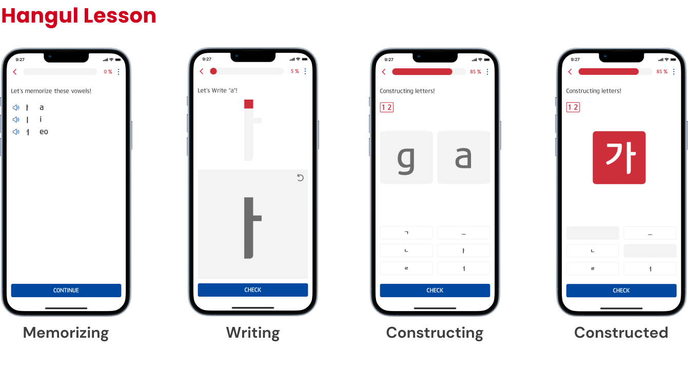
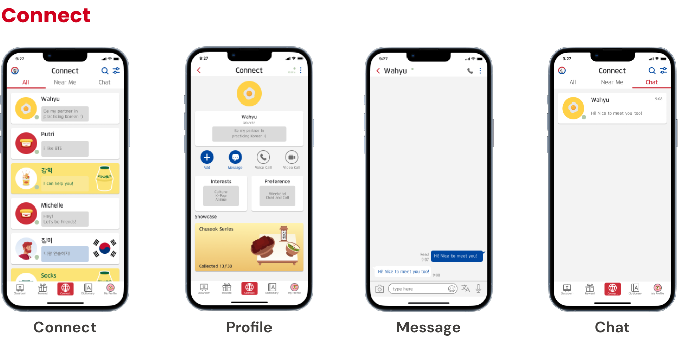
With this journey map we could imagine what would our persona do for each phase of using the main features of the learning app. Obviously she will be a newbie to Korean so she would learn the letters first, then to the lessons and trying to connect with people through chat.
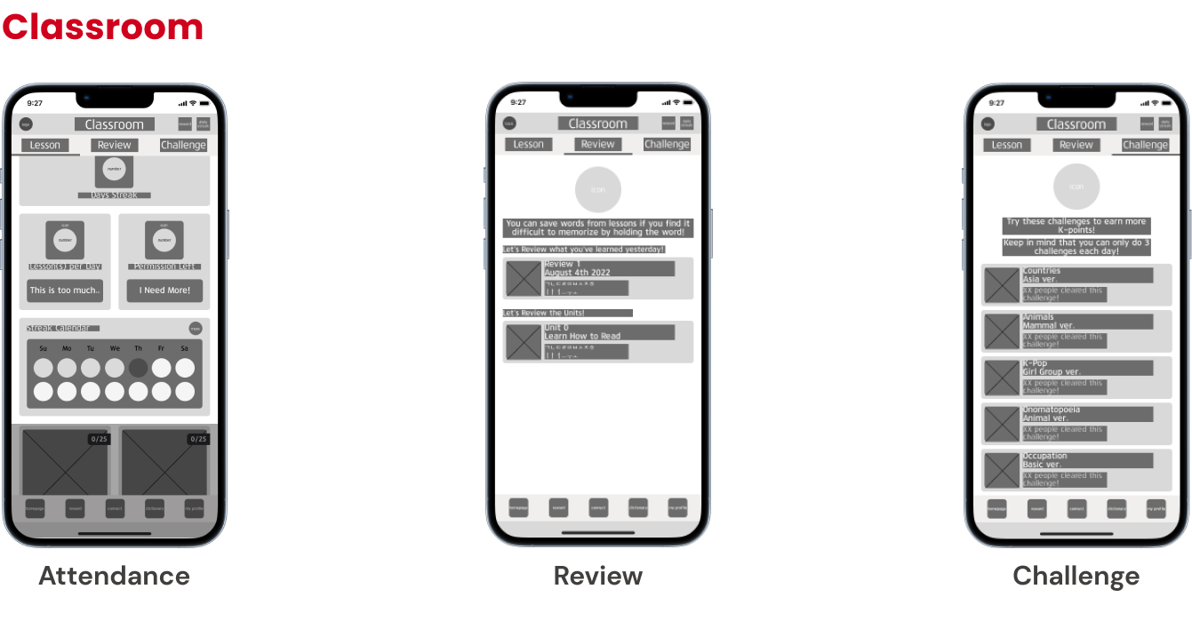
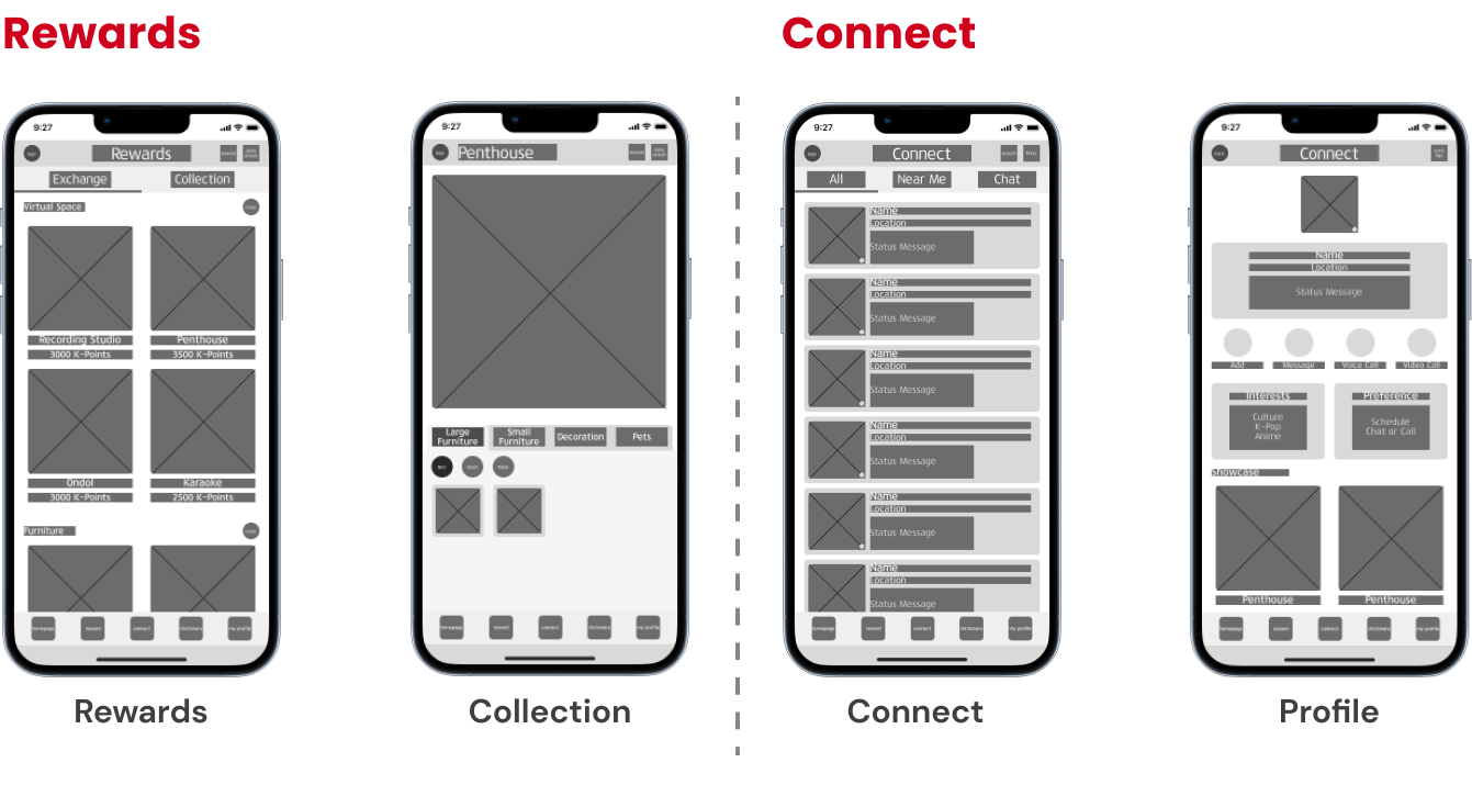
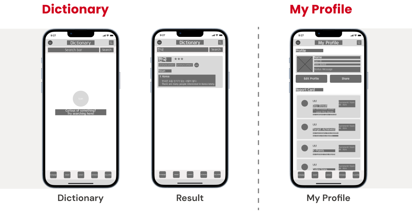
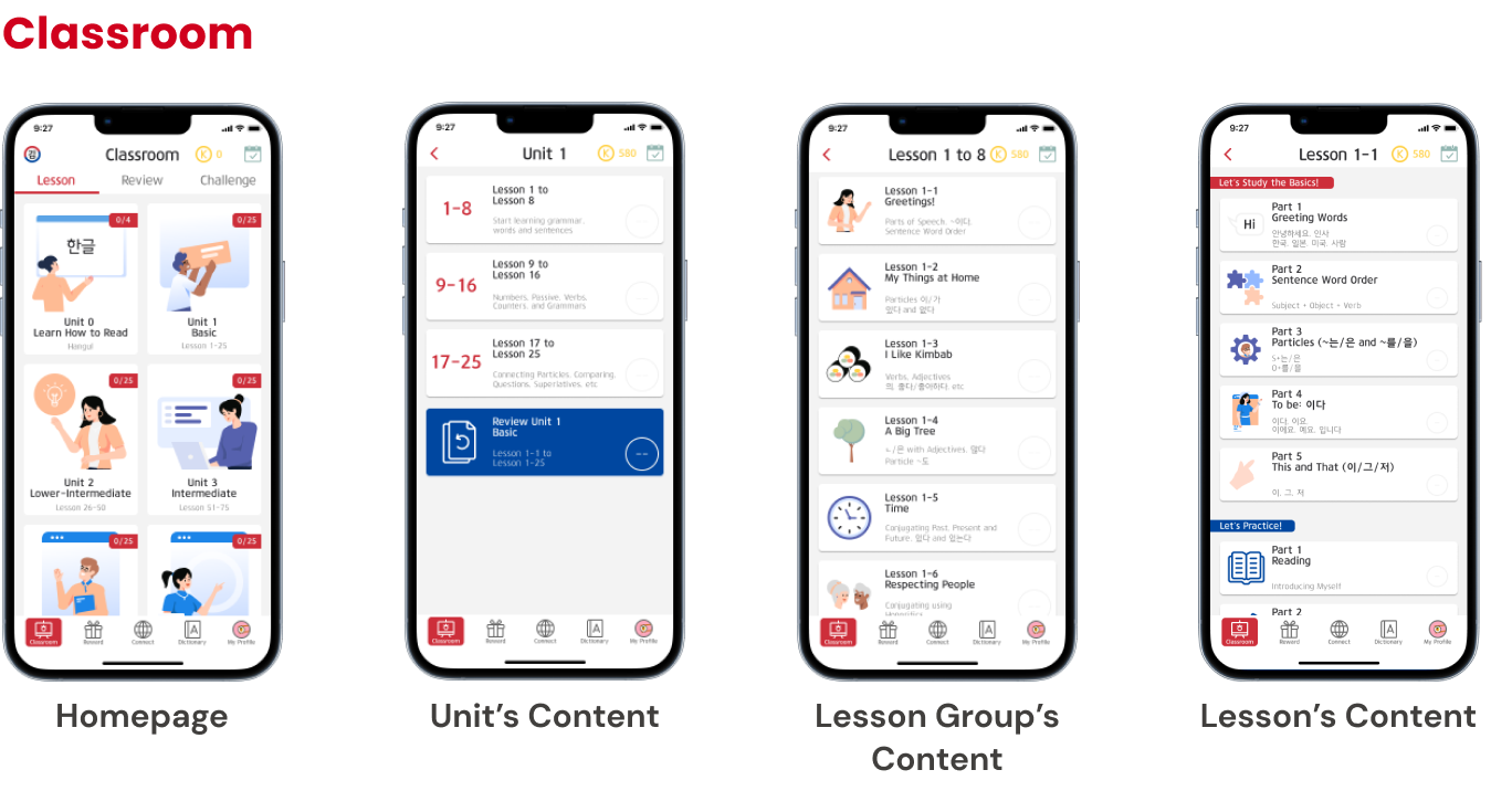
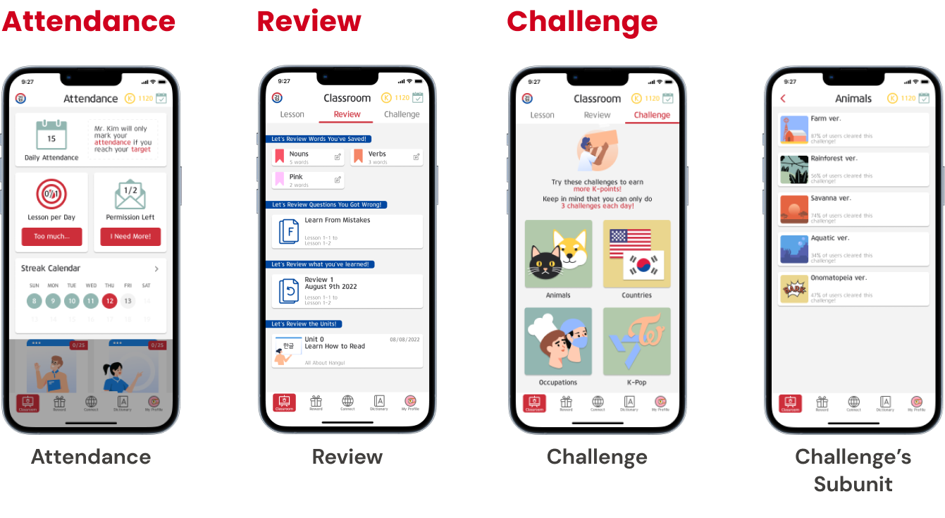
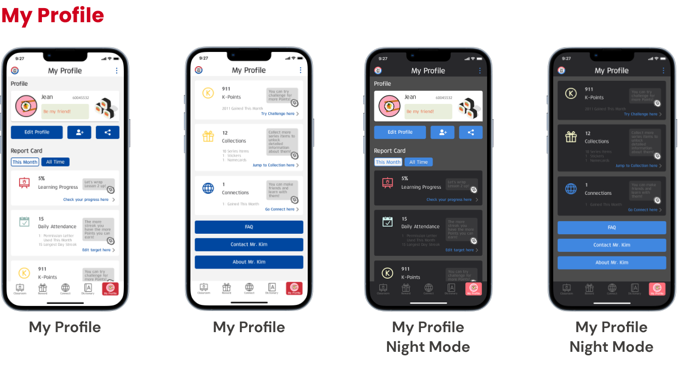
This user flow shows how users would try to learn with the app. It is important for users to easily spot the features and navigate them on this app, thus a simple bottom tab bar that displays all the features of the app and simple functions inside each feature will be the most efficient for users.
Designing lo-fi design digitally saved so much time going to the hi-fi design and is easier to conduct usability testing with respondents via online. For this wireframe, Figma was used for ease of transition from low-fidelity to high-fidelity.

To make sure this redesign was on track, the lo-fi design needed to be tested whether it functions well or not. So, 5 people tried testing it with scenarios as such:
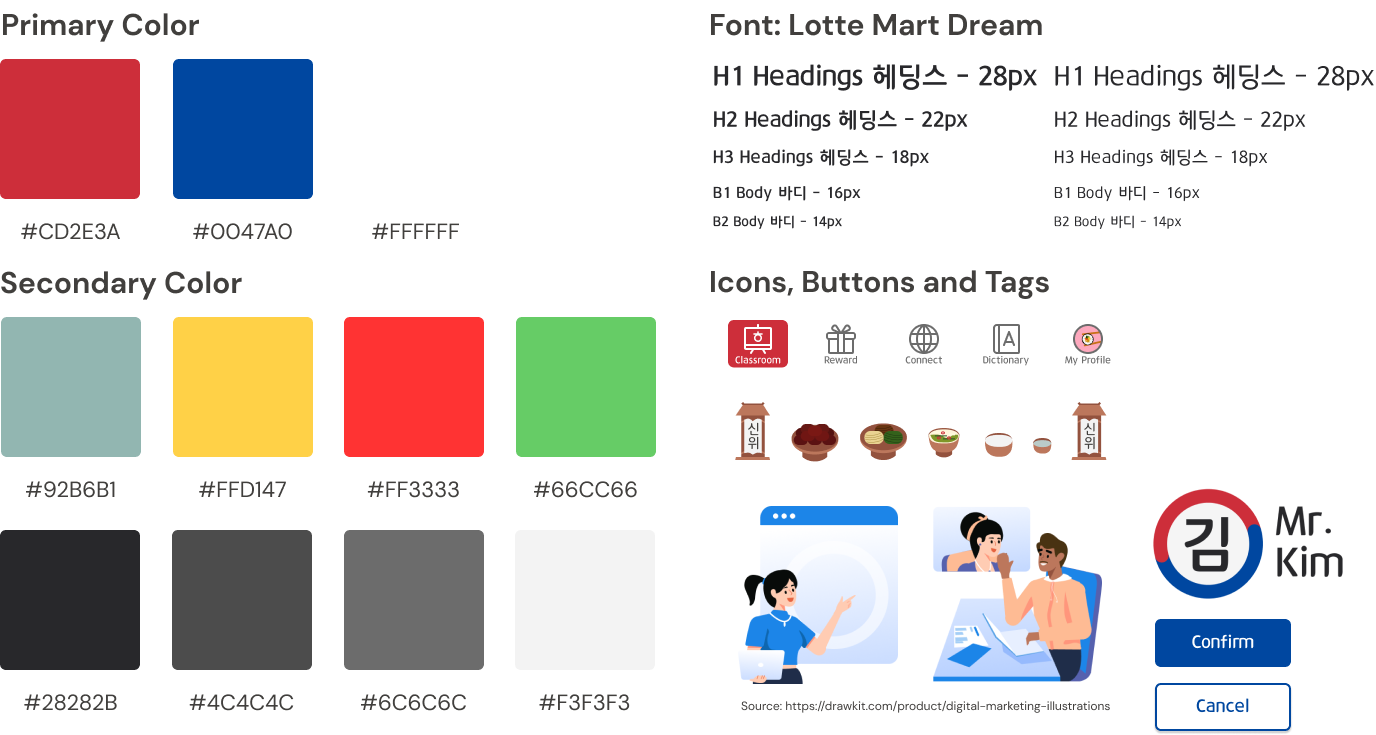
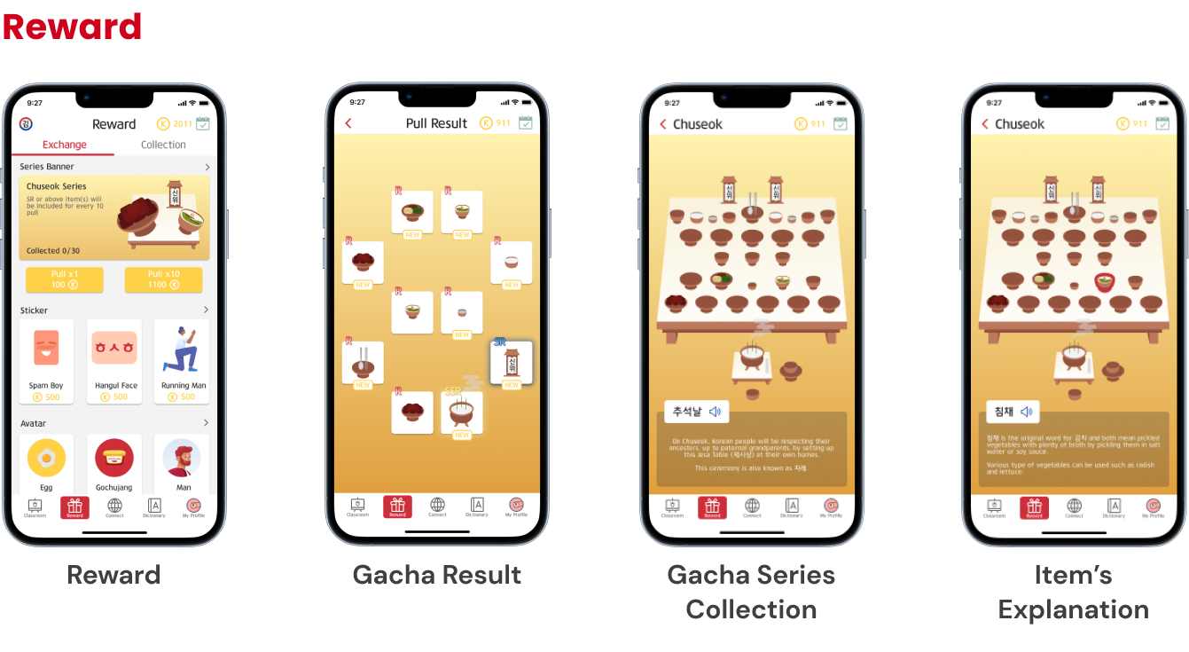
This shade of red, blue and white were chosen for the primary color as it is the color in the Korean flag. To make people notice that this is indeed a Korean-related app a “Korean color” from the flag is decided to represent “Korea”.
On the other hand, the secondary colors are to represent hanbok (Korean’s traditional outfit) and the font from Lotte Mart is generally known in Korean supermarket so it will be easier for users to relate with the design.
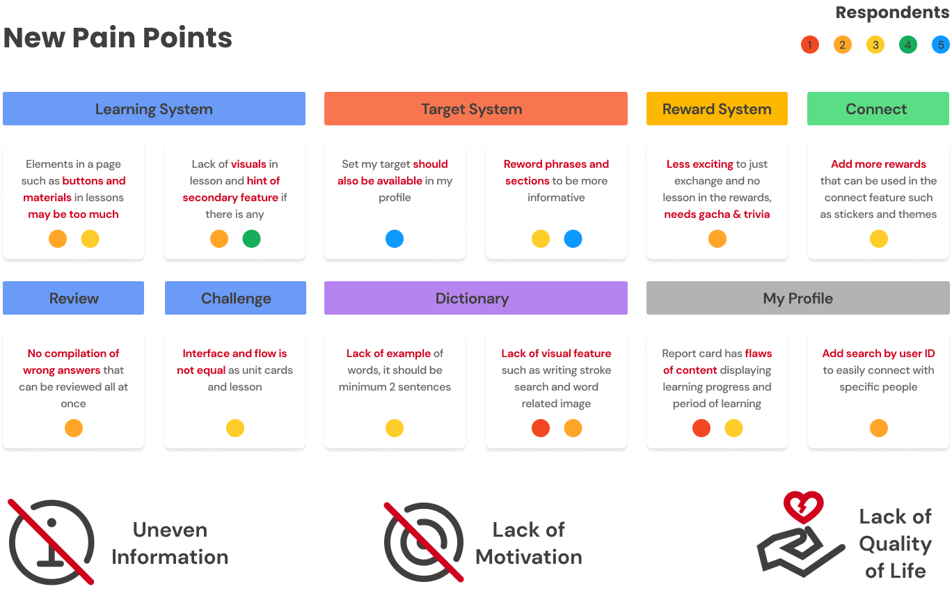
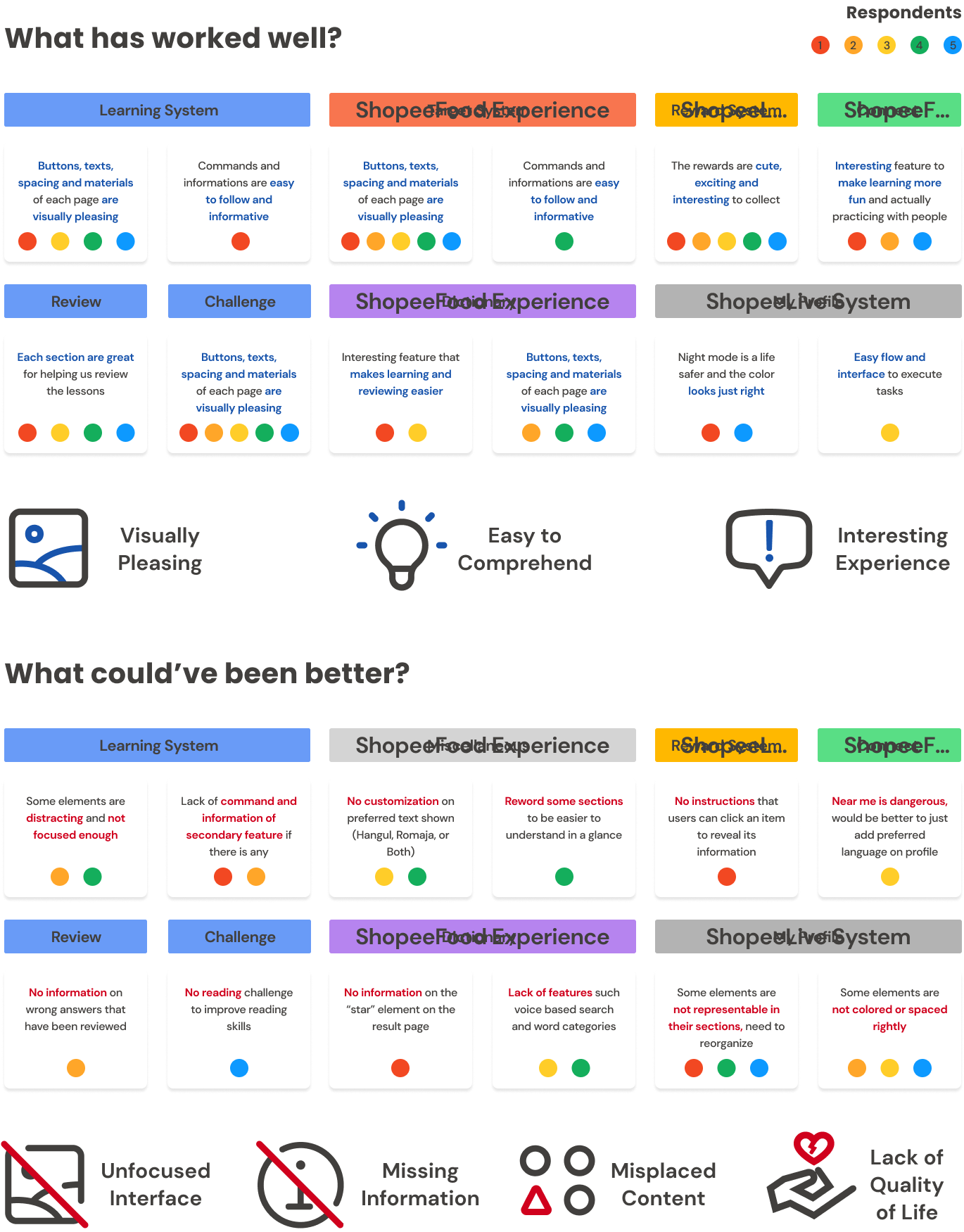
For validation testing, 5 respondents were helping to try the prototype out with the same tasks as the ones who tested the lo-fi design prototype.
Respondents shared that the app itself is pleasing for the most part especially the features that supports the main learning system as it is a nice touch to keep improving in Korean in a fun and exciting way.
However, there are still some things that needed to be improved in the interface layout, information on steps to do, categorizing contents into the right group and quality of life.
For my first app prototype from zero, it was such a delightful journey to research and design this prototype because it is a mixture of gaming and learning app so say that this task killed two birds with one stone. However, there are some points that I learned from this task:
If you like what you see and want to work together, get in touch!
millenniankarinda@gmail.com