Shopee Redesign
Overview
Shopee is one of the biggest e-commerce app and mostly targeted for women for its marketing strategy by holding free shipping, low price guarantee and many promos as women are more into buying monthly consumable items.
However, the e-commerce itself looks like it just works rather than it works and designed well. This can be seen from people around the internet confided that Shopee only has discounts to offer rather than a pleasing interface.
Duration
June - July 2022
(5 weeks)
Tools
Figma, Excel, Paper & Pencil
Competitive Analysis
To understand Shopee as an e-commerce, it is important to also learn, experience, find out what some e-commerces have done well and poorly and what people thought of them.


- Promo and discount related features are easy to access and the MVP of Shopee
- Interface is too rigid whether it’s buttons, cards, or fonts
- Interface is clean and friendly with more rounded edges, cute illustrations and tidy spacing between items
- Information about each promo and discount is easy to miss
- Information are shown directly it became easy to navigate through the app
- There is no result for shop only or related shop selling searched item
- Interface is clean and friendly with more rounded edges and tidy spacing between items
- Some pages can be too barren because of too many white spaces
- More white space makes the app looks more breatheable
- Terrible shopping flow and interface it is confusing to navigate through the app
“Improve INTERFACE for a clean and friendly look and look out for potential missed feature or information.”
User Interview +
Pain Points
I conducted user interview and tests for users and nonusers,
7 respondents each, to know more what newbies and pros
think of the app as a whole. They were given tasks as such:
- What is your first impression on the homepage after opening the app?
- What steps are you going for to find and checkout an item?
- Are there any features you are using/would use besides shopping?


Cluttered Interface
Poor Flow
Hierarchy Issue
Incomplete Information
- Homepage, search result, other features’ interface looks messy.
- Simple look is preferred with more spacing between items
- Expedition delivery option only can be edited after payment
- Frequently used features is not highlighted and easy to miss
- Some informations are not how they are supposed to be highlighted
- Ambiguous wording on some information
- Information on top up charge is not visible
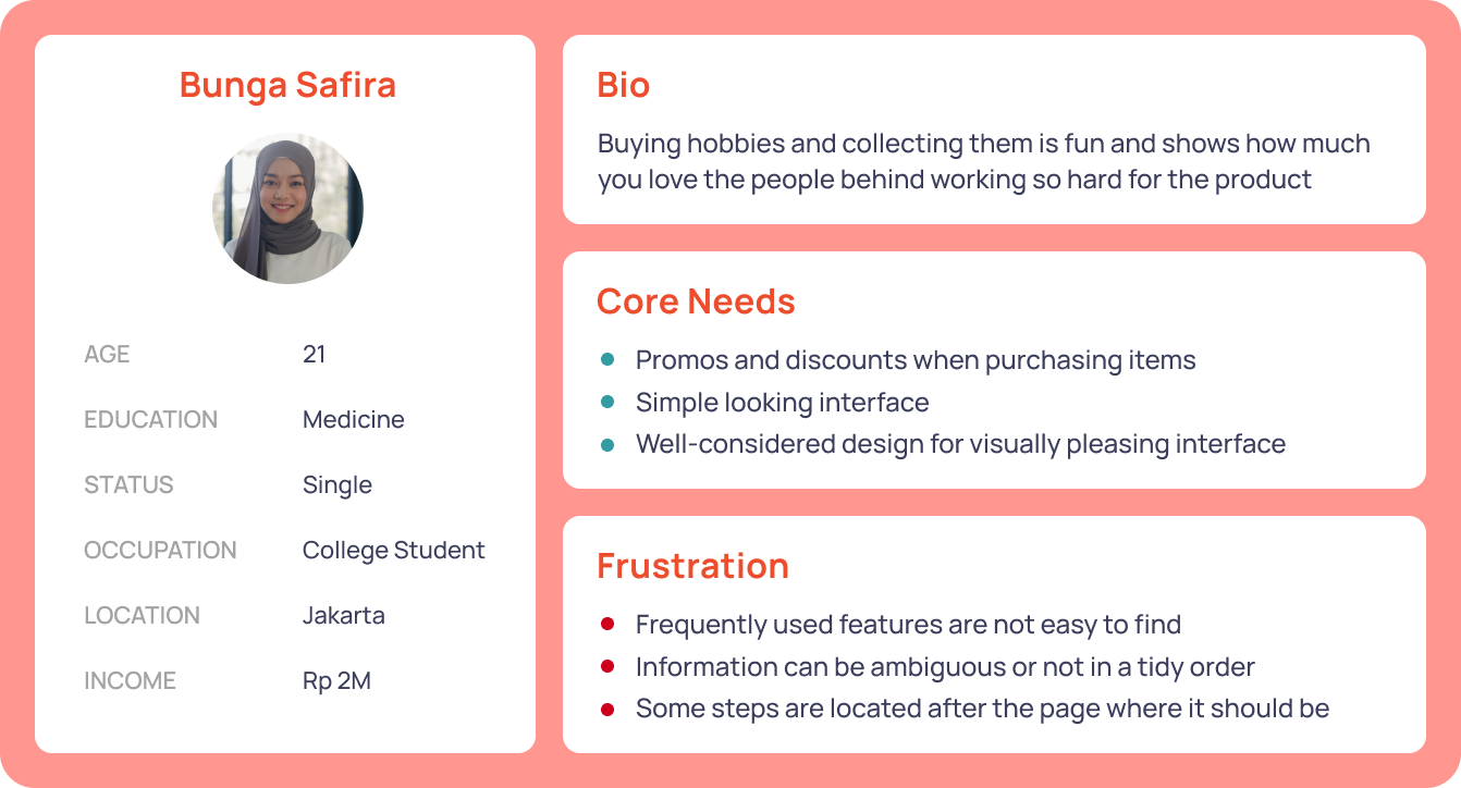
User Persona
By using user persona according to how Shopee user is stereotipically, it will be much easier to analyse which needs are urgent for improvement from the original and frustrations to take care of.
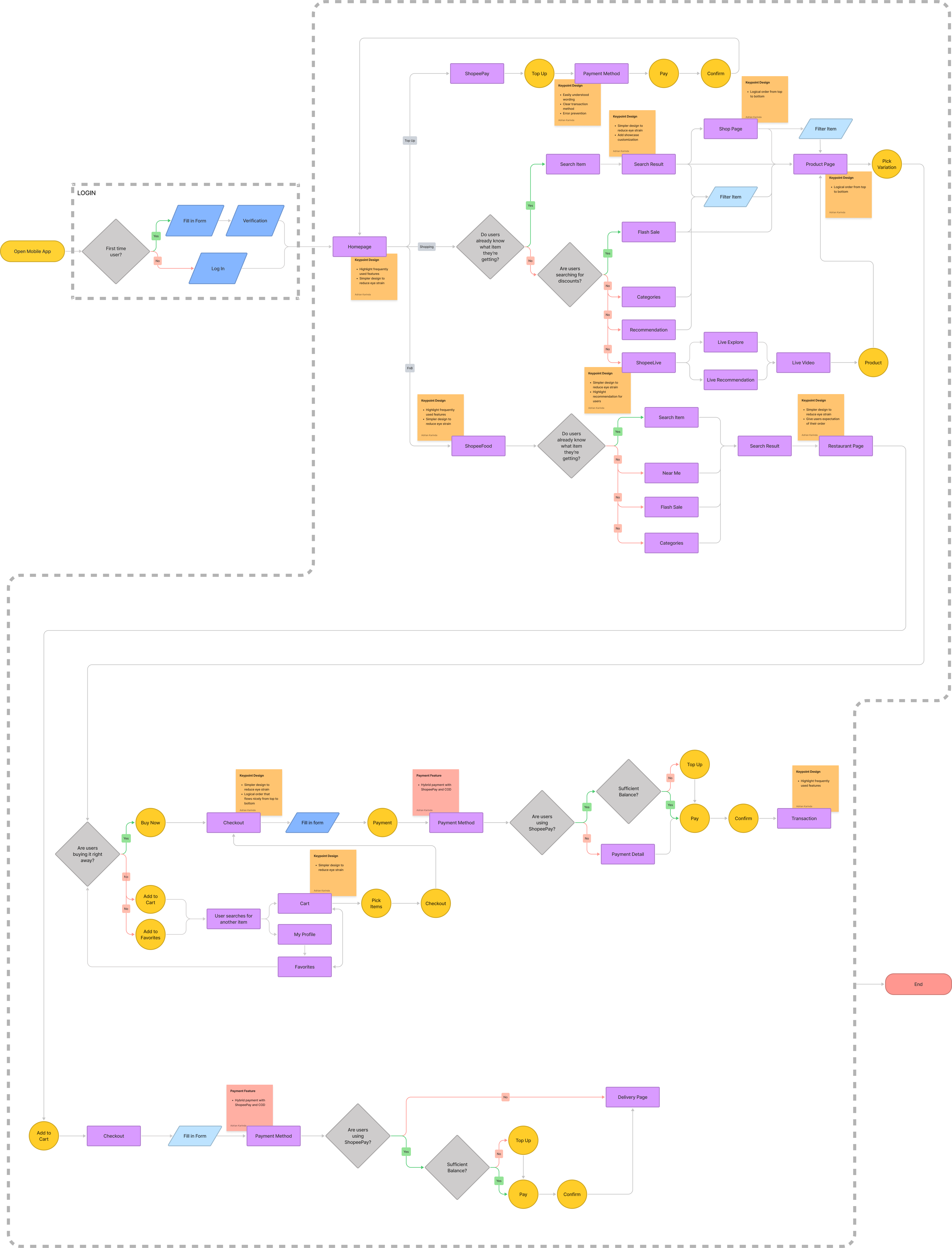
User Flow
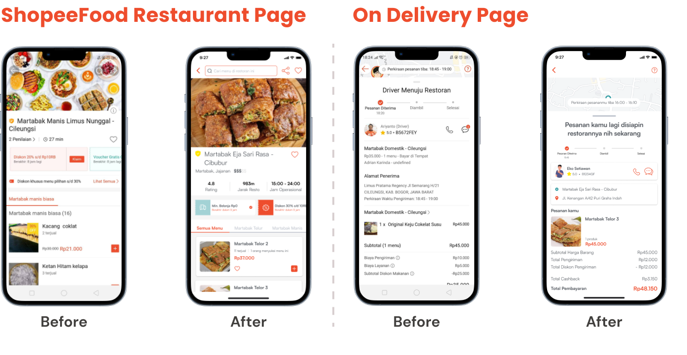
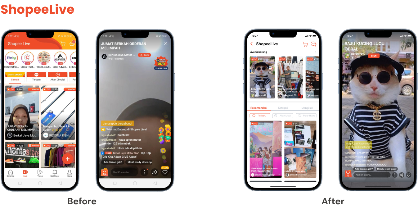
This userflow shows how users would shop for items, food, and/or watch videos of shops promoting their products live on app. The 3 most used features according to user interviews are as such Shopee shopping, ShopeeFood and ShopeeLive.
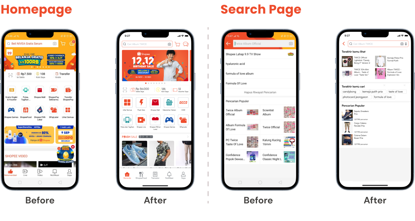
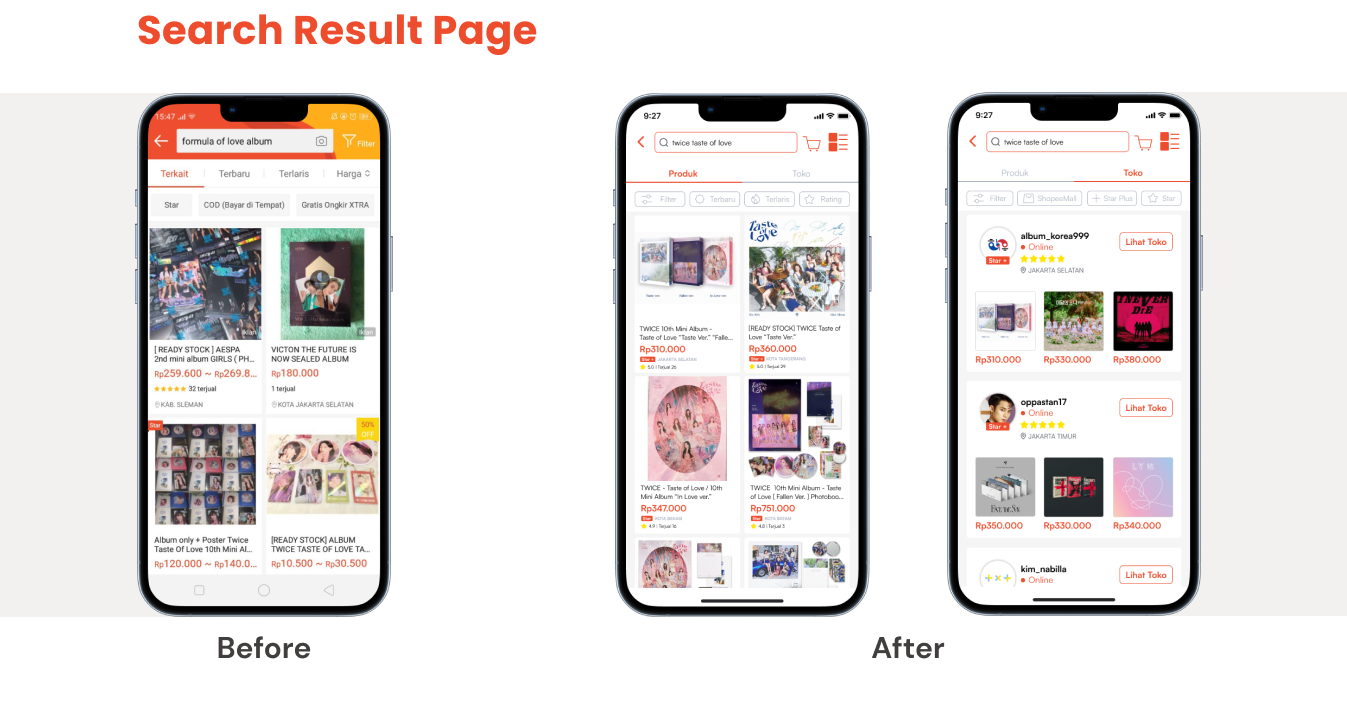
Wireframes
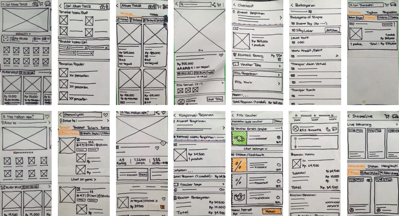
Sketching with pencil and paper for the lo-fi wireframes was done to make it easier for iteration how the redesign will compare to the original easily.
Usability Testing
To make sure this redesign was on track, the lo-fi design paper prototype needed to be tested whether it functions well or not. Thus, 7 respondents were testing the paper portotype with tasks as such:
- Search for a product that you want and purchase it.
- Buy some food for your lunch.
- Watch a livestream of people promoting their product.
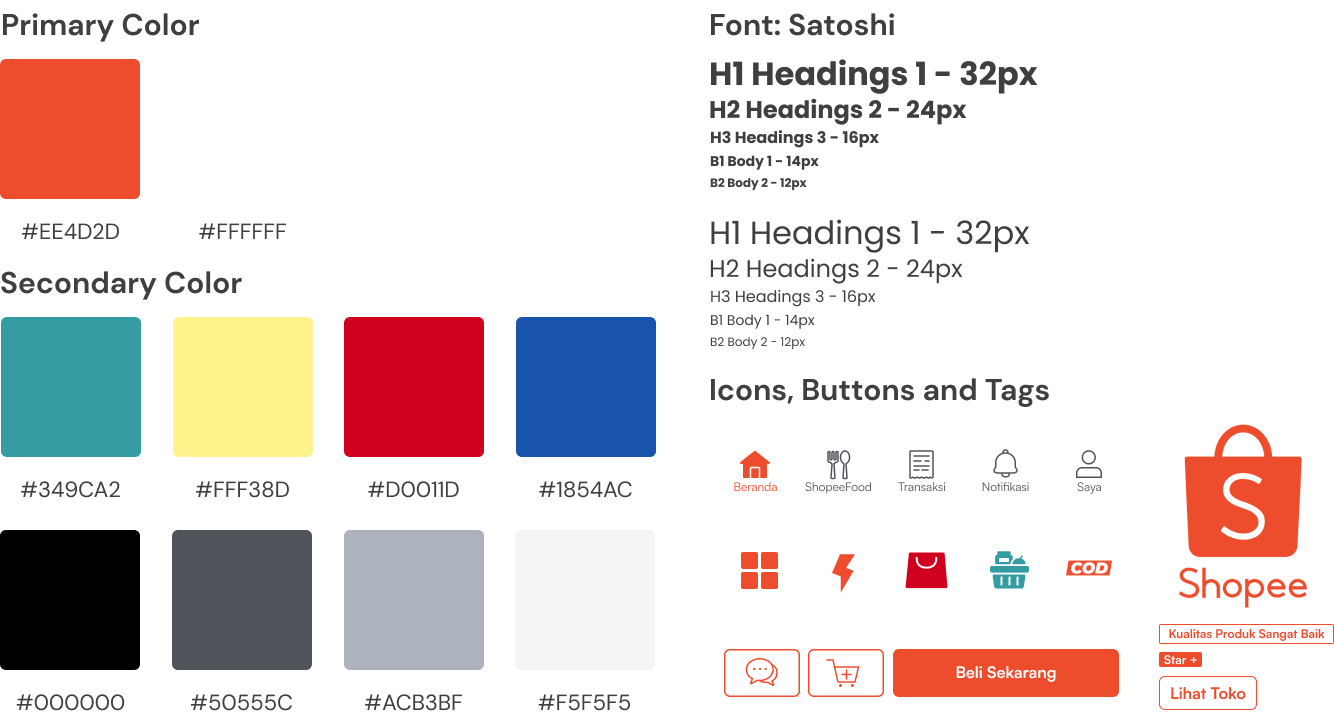
Style Guide
By making a style guide it will be easier to achieve consistency and time efficiency to adjust all the elements in the design.
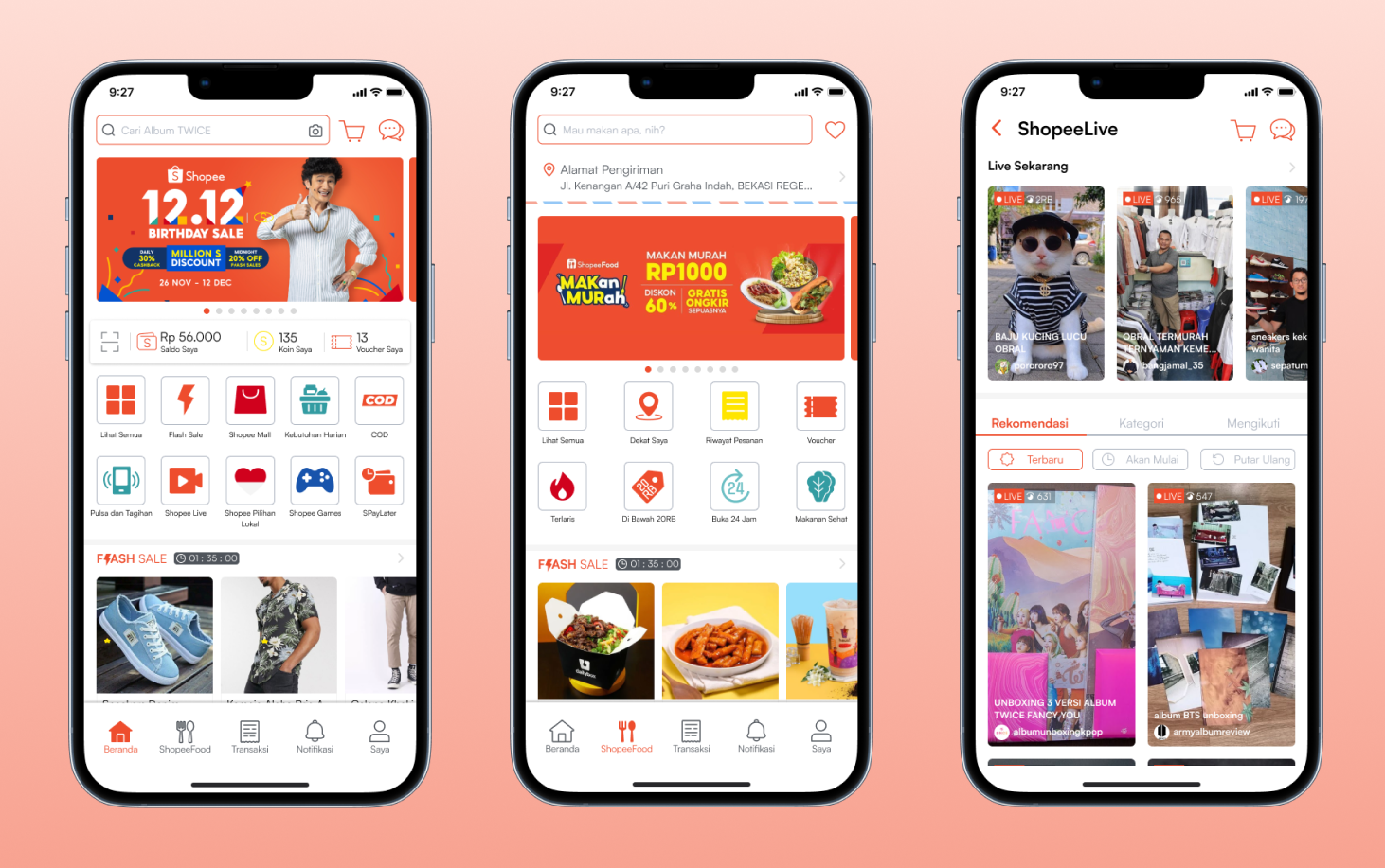
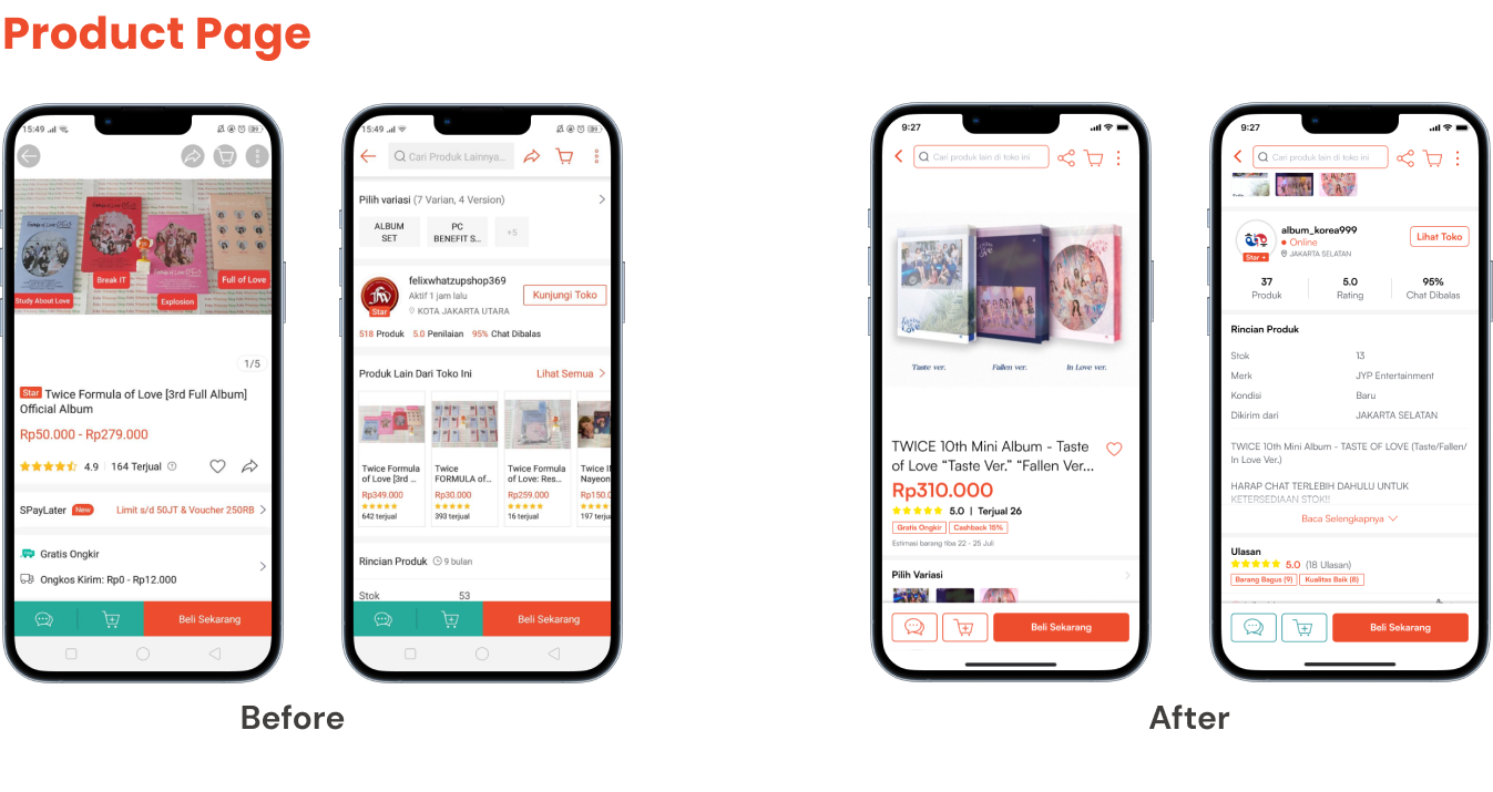
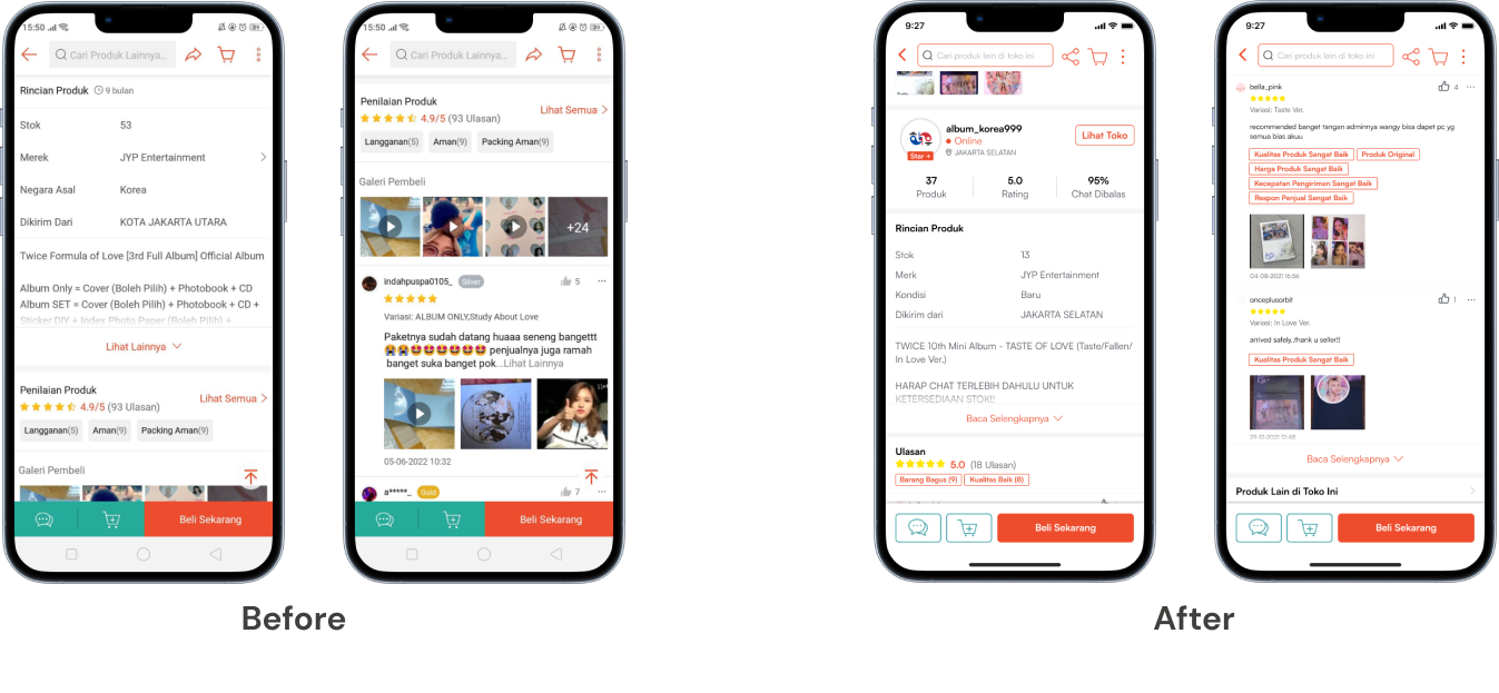
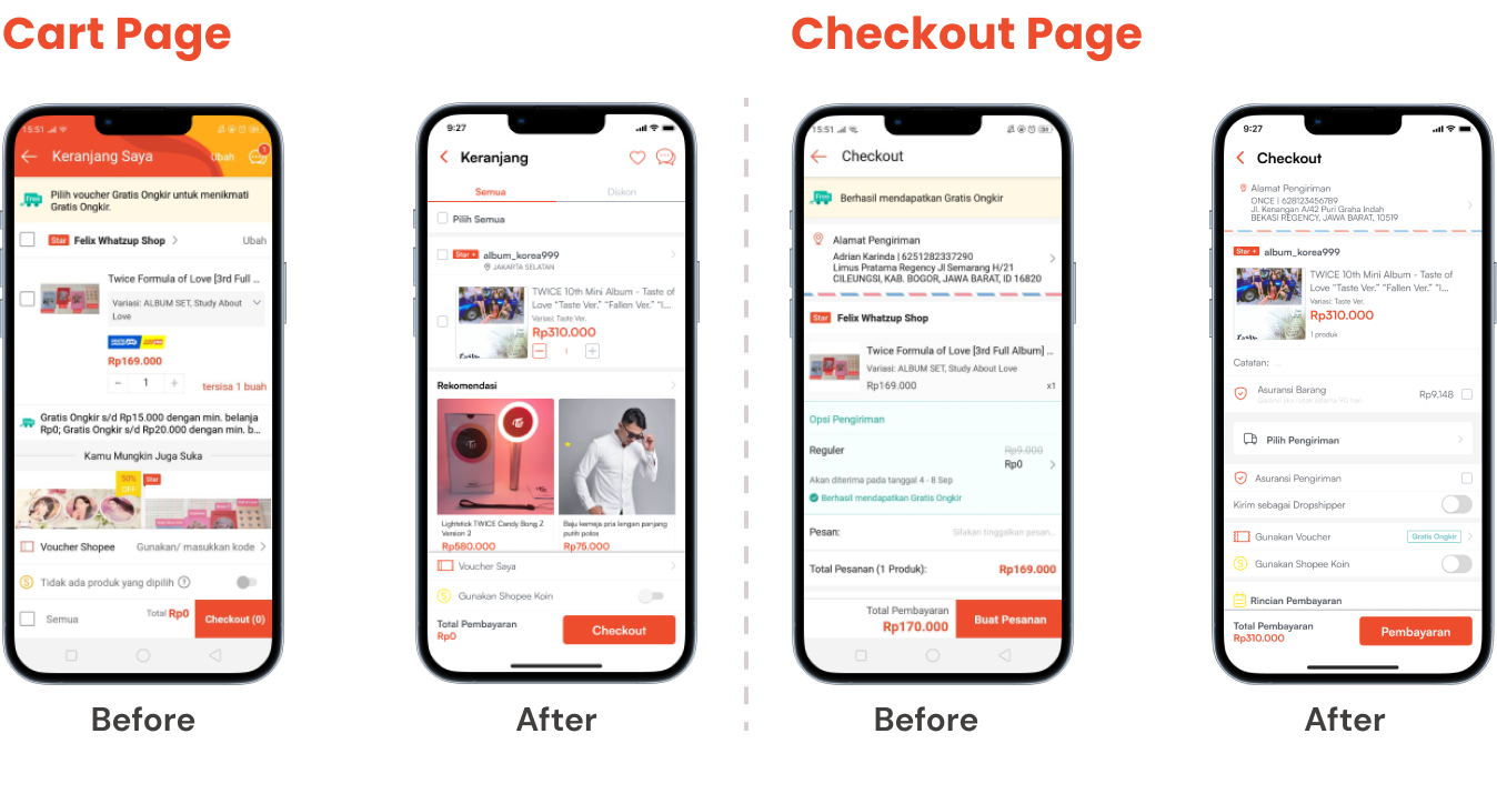
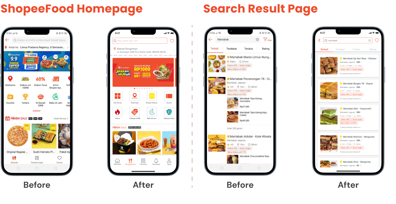
Final Look of the Redesign
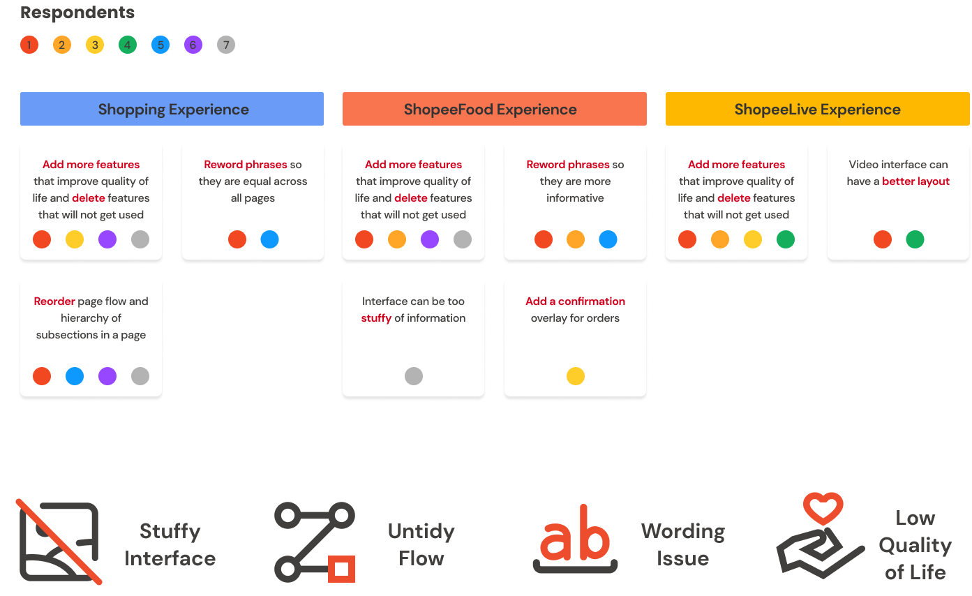
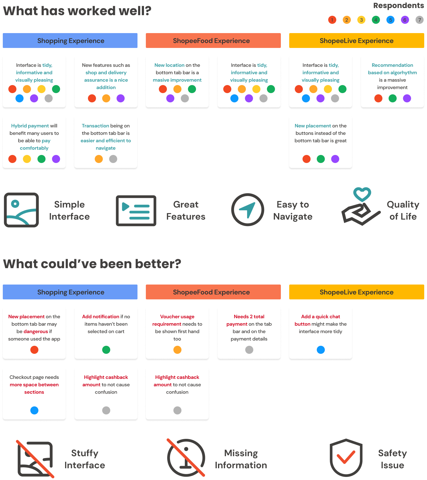
Validation Test
For validation testing, 7 people were testing the paper prototype with tasks as such:
- Search for a product that you want and purchase it.
- Buy some food for your lunch.
- Watch a livestream of people promoting their product.
Respondents agreed that this redesign is overall better especially with how the new interface looked and flow felt which is more of the concern respondents from user interviews had agreed on. However, there are some minor things they caught on that still need to be fixed to improve the experience of users using this redesign prototype.
Reflection
For the first redesign and UI/UX task it wasn’t really that bad for research because as an architecture graduate the architecture mindset isn’t really that far off with how UX researchers do their early research and analysis.
In addition, I learned how to conduct a new type of interview and testing that I’ve never done in architecture school before and that is by letting the respondents to really try our prototype first-hand without explaining deeply about it first thus resulting in a new perspective of insights that might have got overlooked.
Other than that these two points are the most memorable lesson I need to consider for my future projects:
asas
- Less respondents, deeper interviews
Reducing respondents to max 5 people but having deeper questions such as comparing ideas or card sorting could bring more insights out that could get overlooked. - Compare redesign with original while prototyping
Keeping the redesign on track to make sure it will be better than the original is something that been missed in this project. Even though the redesign might looked worse or not even better than the original the respondents still claimed that it is an improvement from the original. Next time, it’s better to compare them over time to get a better in design.