Overview
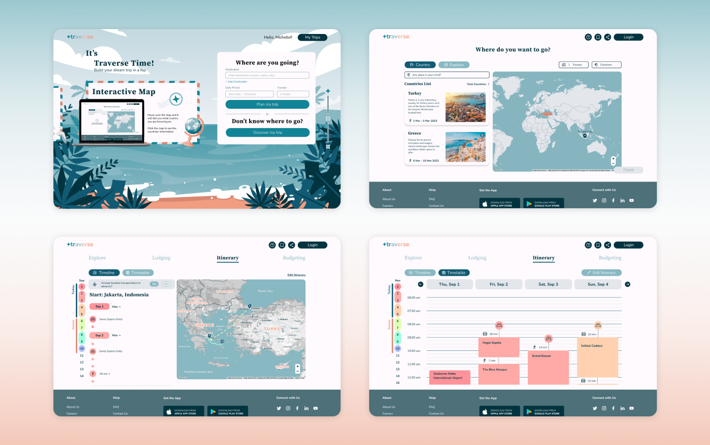
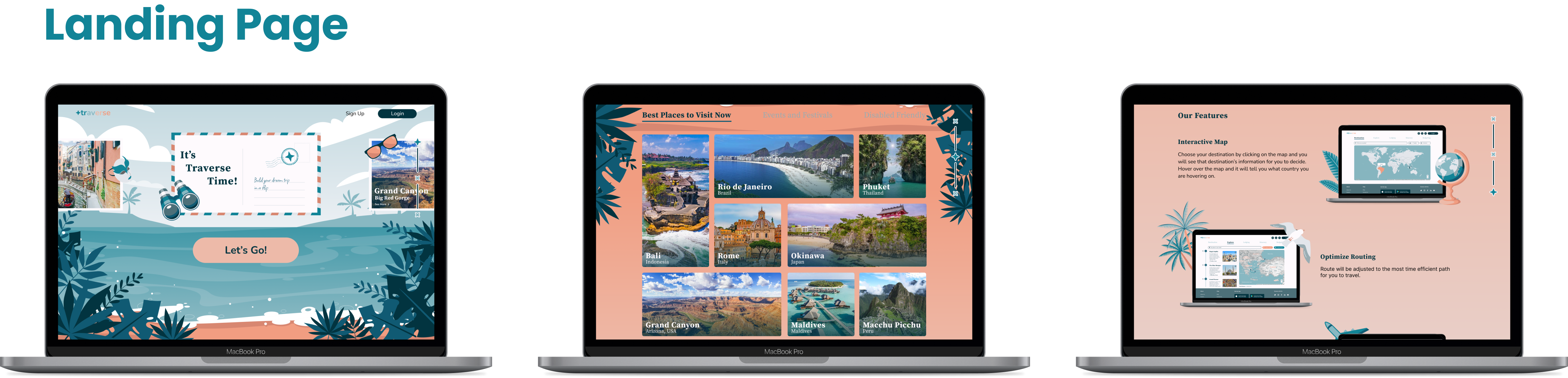
Traverse is a web trip planner to help people create their own itinerary in detail with fun.
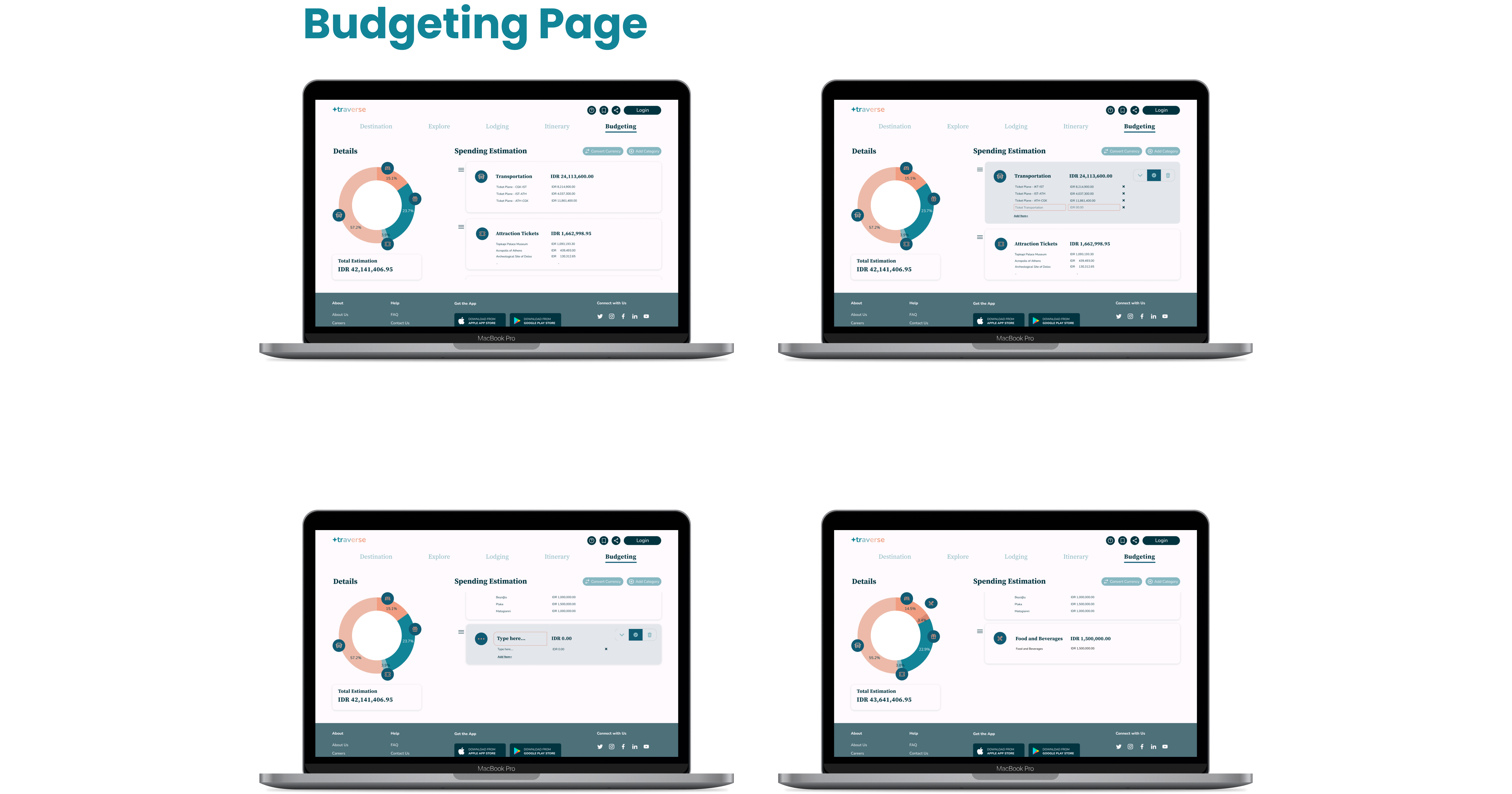
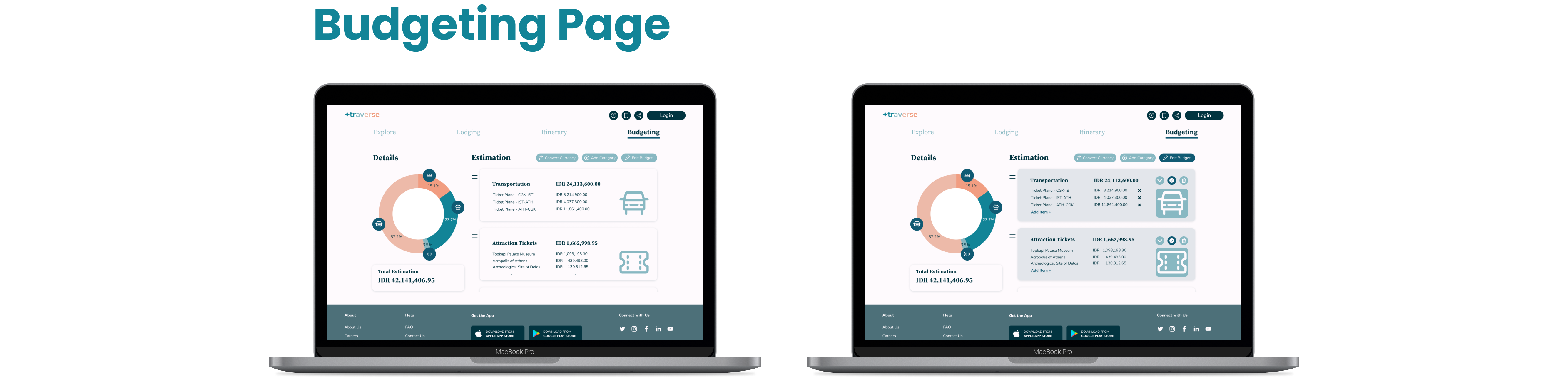
It offers features that increases the quality of life of users such as auto-generated routing to enhance efficiency in travel, estimating budgets and also adding or removing items that have or have not been included in the planner.
Millennian Ibnu A K
Kenia Visakha Zerlinda
Felia Hutari Dwi Putri
UI/UX Designer
UI/UX Designer
UI/UX Designer
Oct 2022 - Feb 2023
( 4 months, Dec 2022 break)
Figma, Miro
According to Statista, travelers are not having a good experience with travel tech because of factors that are out of the reach of design's capabilities, i.e. how prices keep changing and slow website.
However, there is a point that can be solved by design and that is the flexibility of such travel tech. Travelers are much more at ease with the concept of freely edit their travel as they please.
In the other hand, another research by Statista also shows how tech has helped travelers. By saving time to plan such trips with tech, it really comes to mind that planning efficiently is greatly preferred by travelers.
“Travel techs need to have FLEXIBILITY and EFFICIENTLY help travelers to plan their trips. ”
Conducting analysis of other existing web planners helped to narrow down what concept, content and the dos and don'ts that need to be pursued in the design.


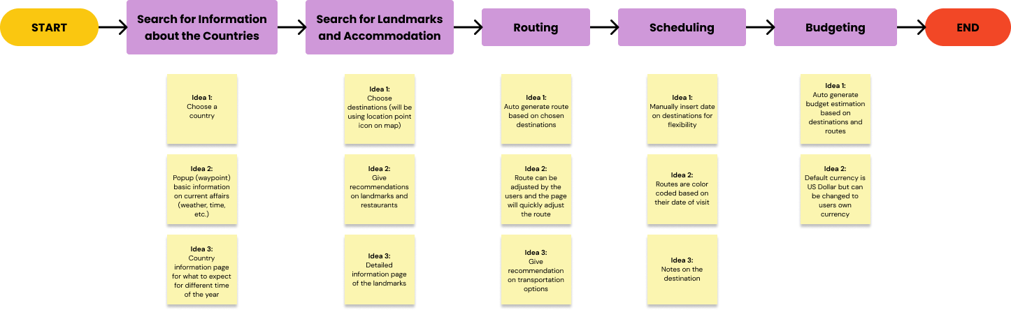
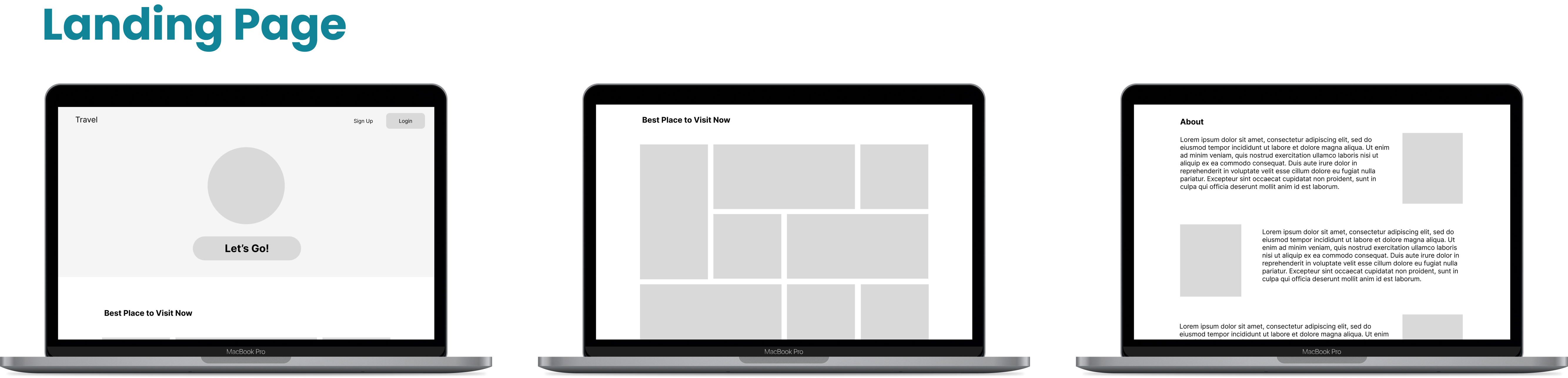
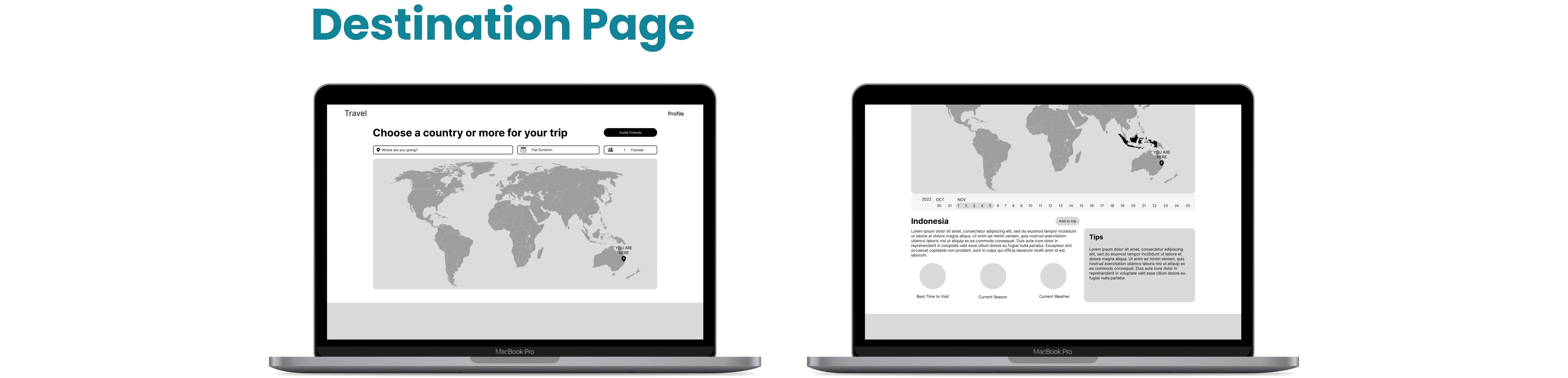
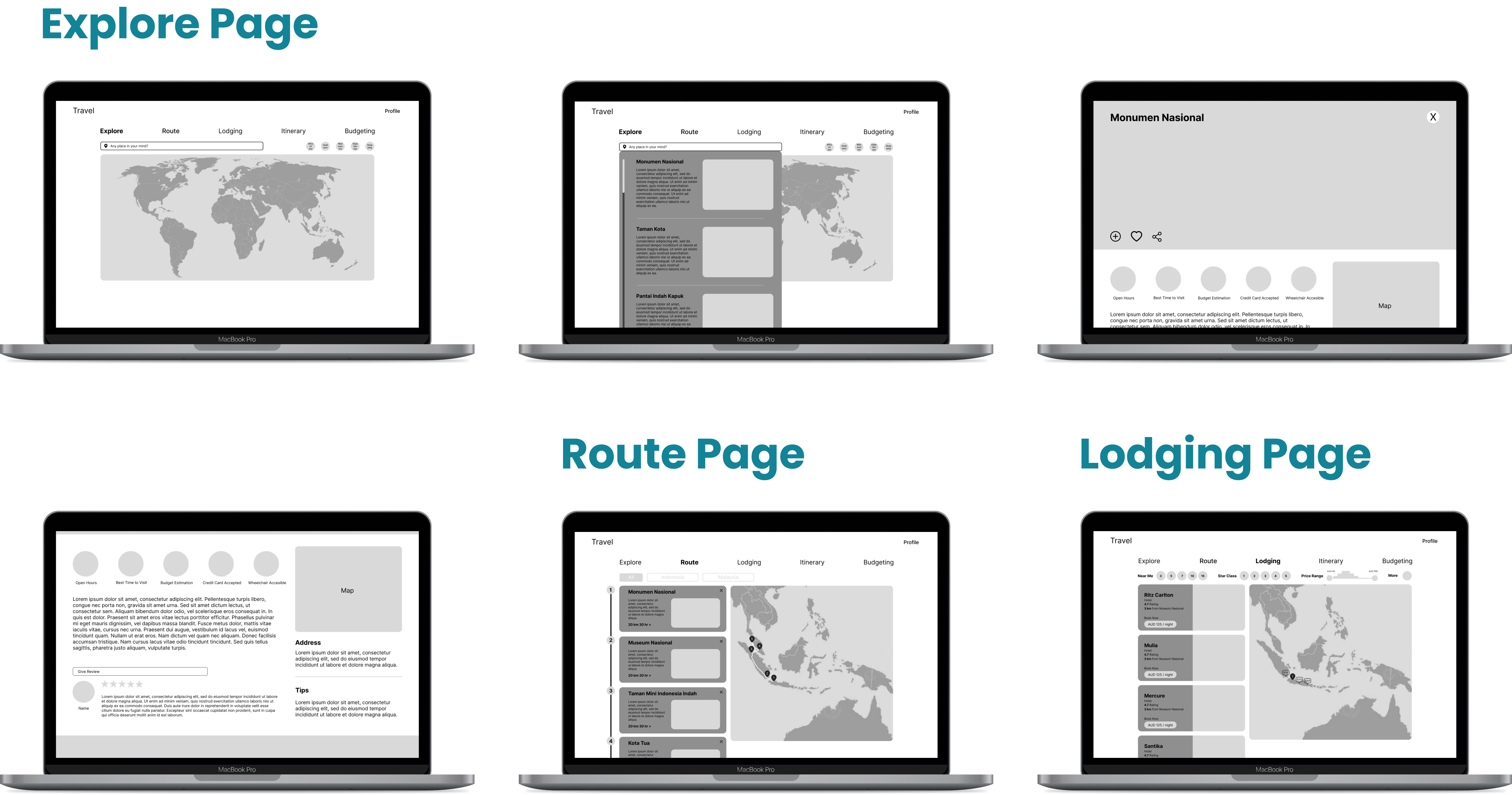
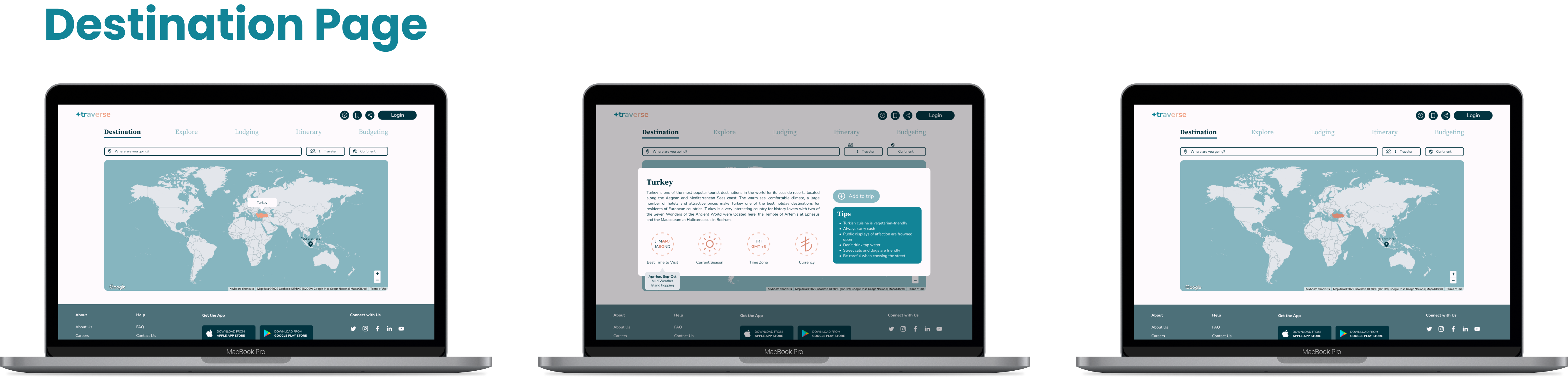
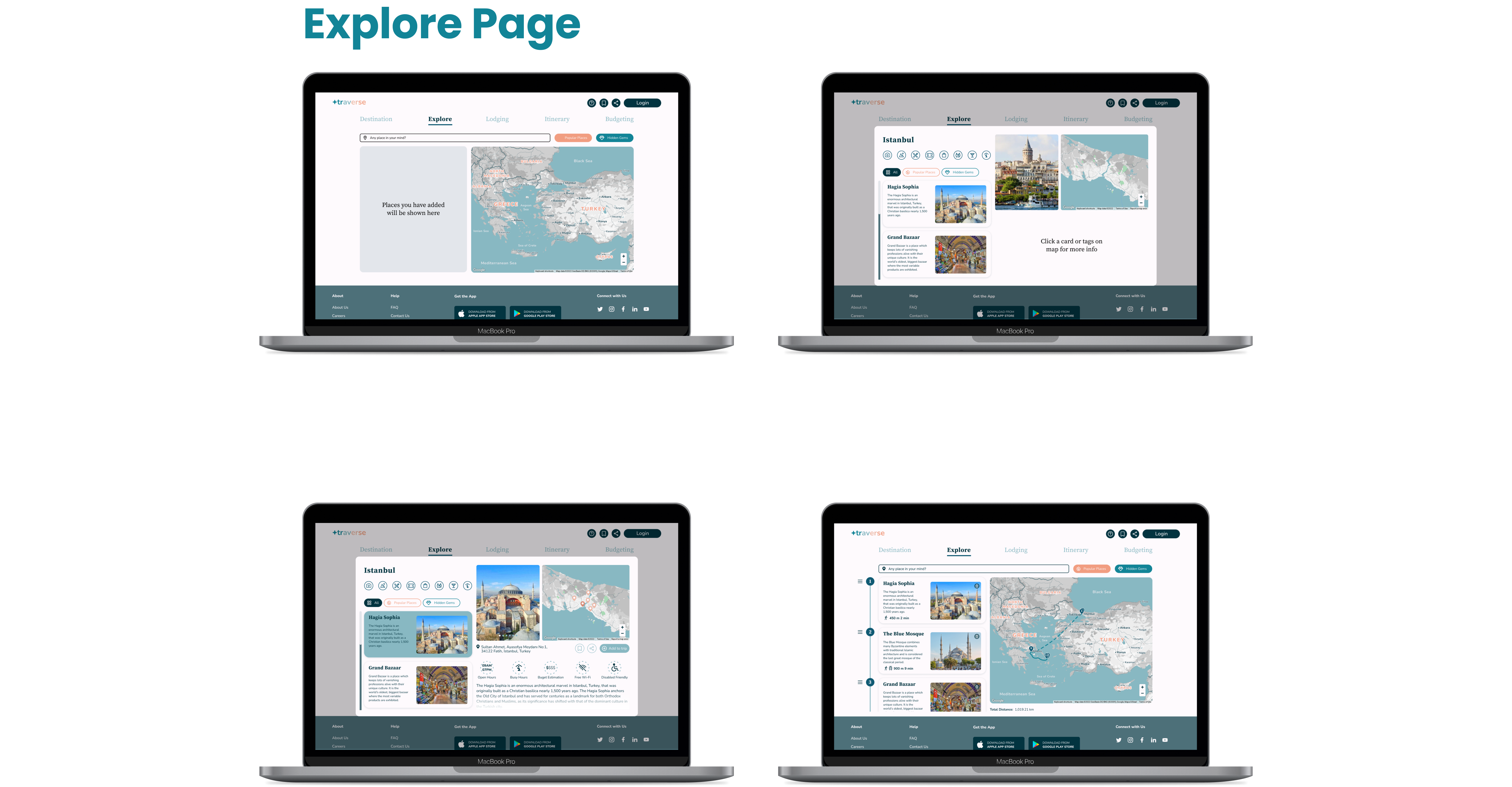
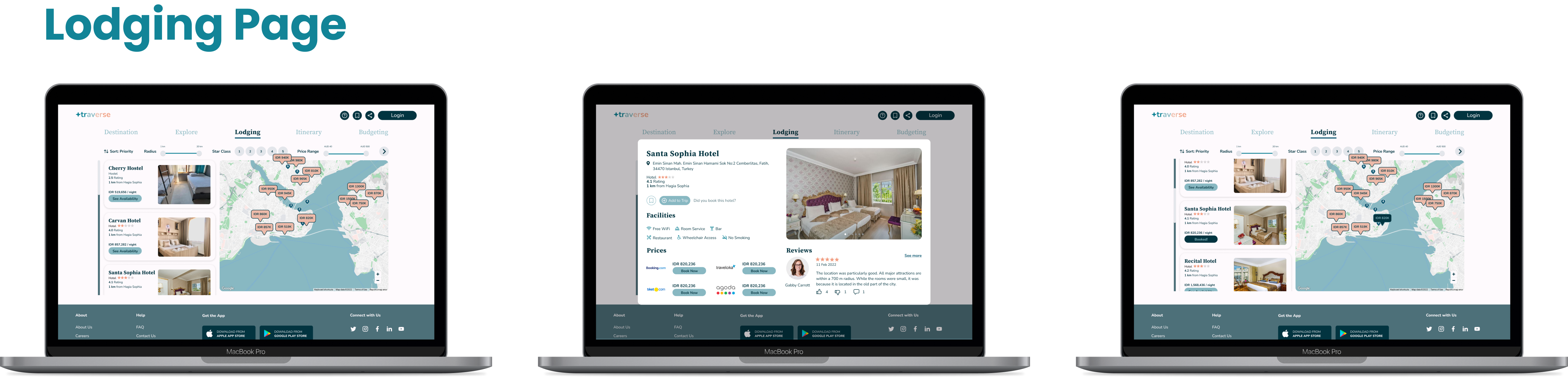
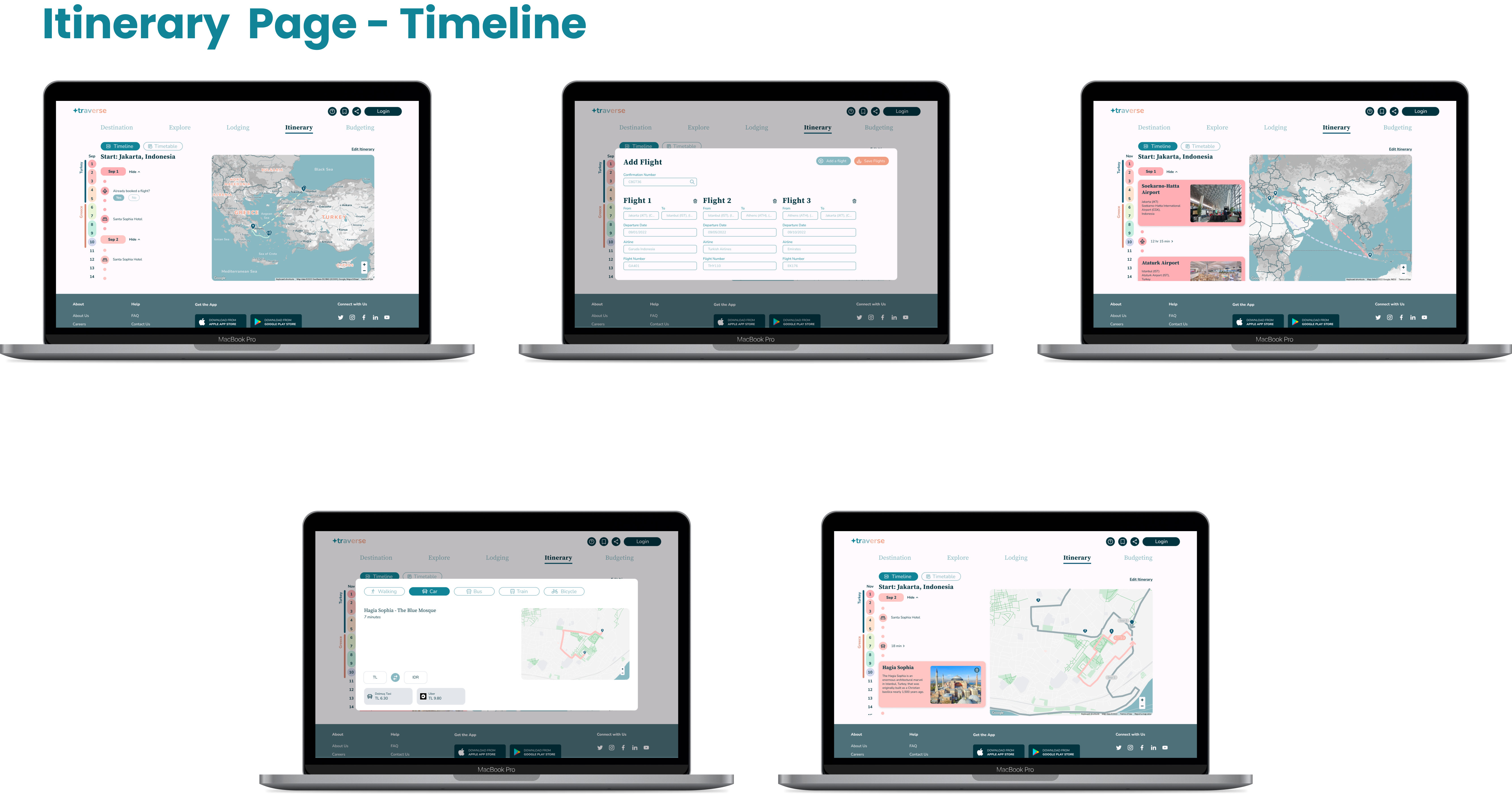
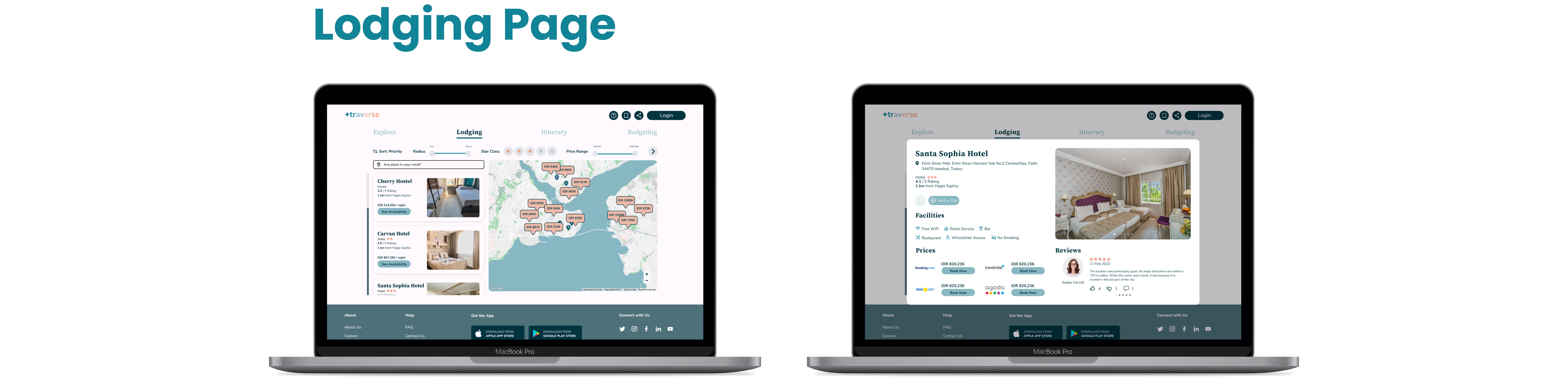
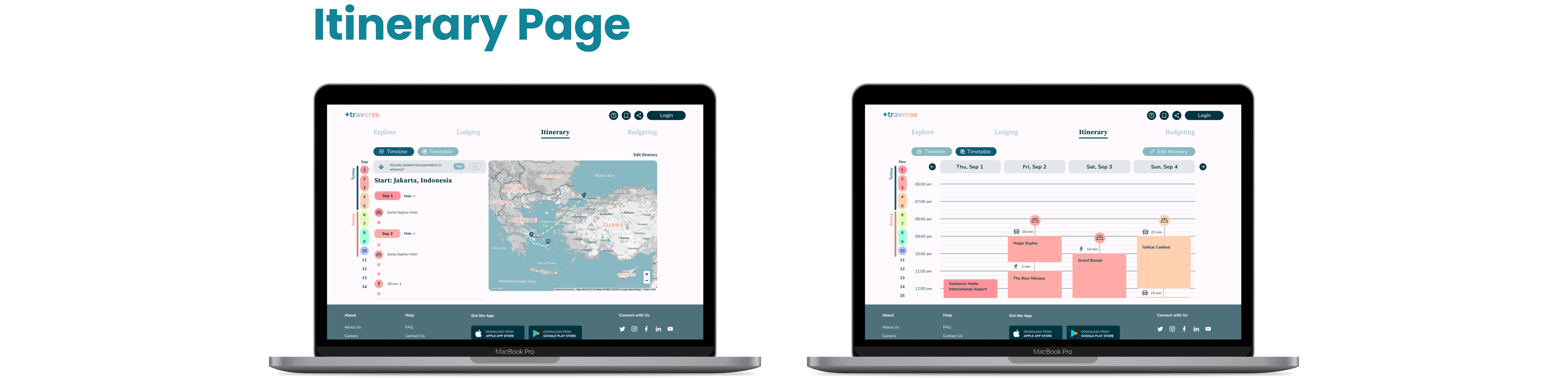
“Detailed INFORMATION on recommended places, itinerary, hotel booking, budget estimation and routing on map with a FUN, CUTE, SIMPLE and CLEAN interface. ”
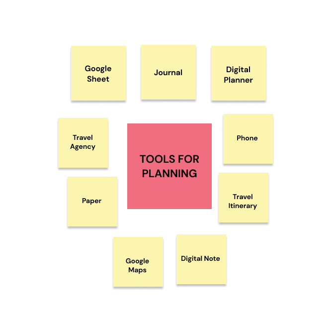
Having 10 respondents to explain how they usually plan a trip digitally or conventionally through a survey gave new insights to key features that are urgently needed in a trip planner.
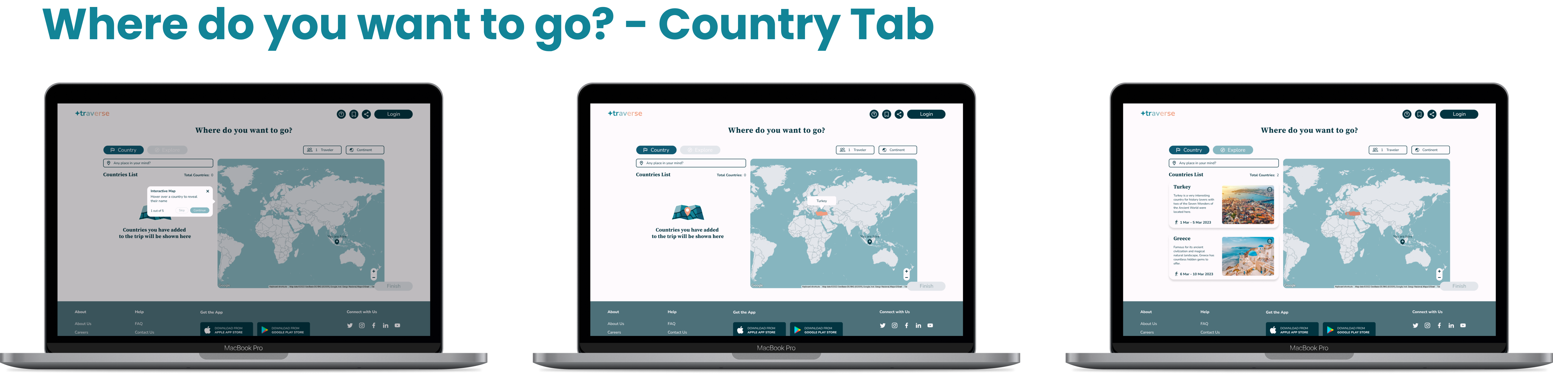
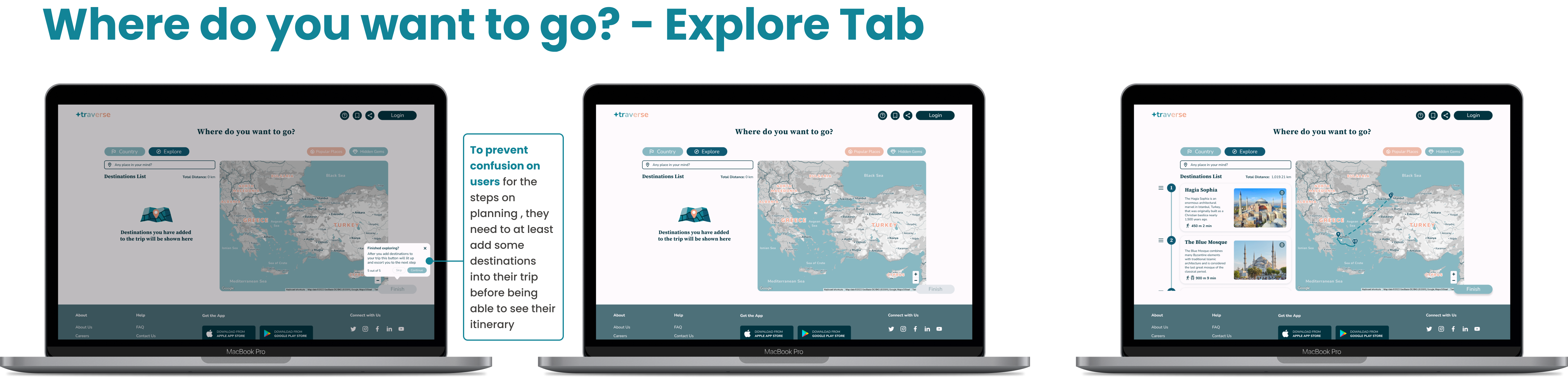
“DESTINATIONS and STOPS are the most important. ”
“PLANNER-like visual is preferred i.e. calendar and tables. ”
“5 STEPS flow is more detailed in planning. ”
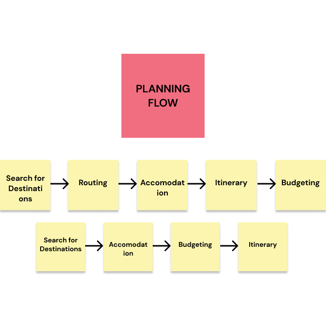
This user flow shows the initial idea of how users would plan using the web. The order of the flow will be from the most important information needed to get to the least important one.
Conducting interview and tests for 5 users who have used a digital planner for their trip to know more what they think of their experience using those apps. They were given questions as such:
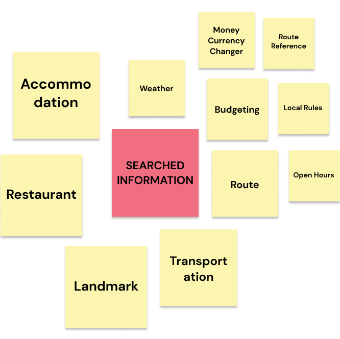
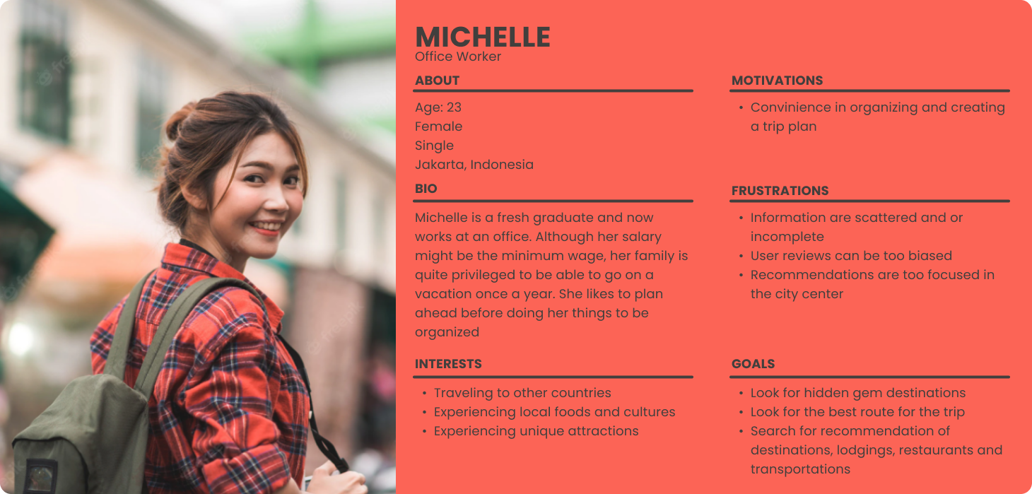
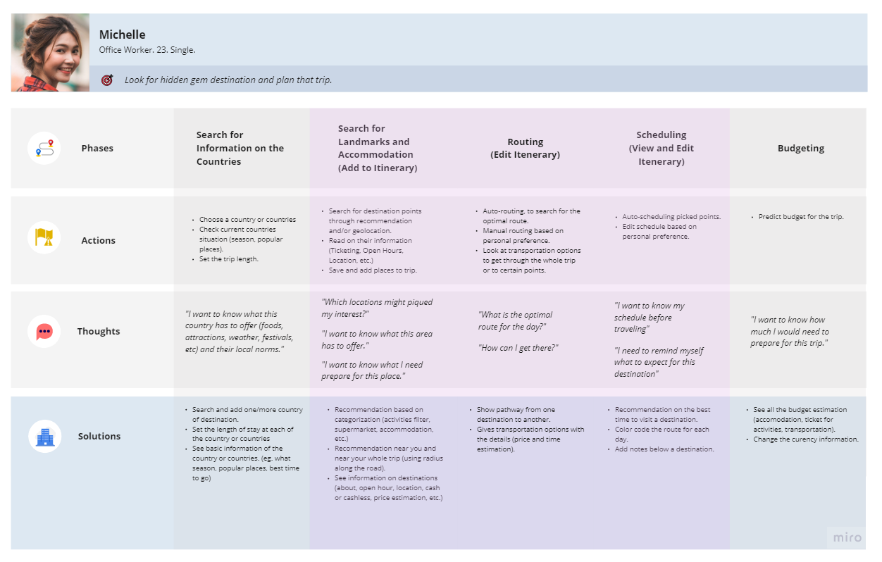
Using user persona according to how respondents experienced and need in the user interview, most of them seeks detailed information on destinations, accommodations, transportations and itinerary for a smooth trip.
With this journey map we could imagine what would our persona do for each step of planning their trip. She will need to do tasks in 5 sections.
As a team, we each interpret our own ideas into sketches and present them to the team. Then we discussed which ideas will be implemented and could be merged for the better of the design.
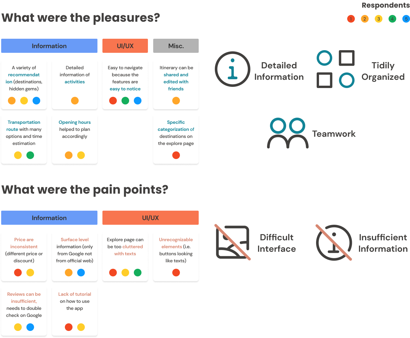
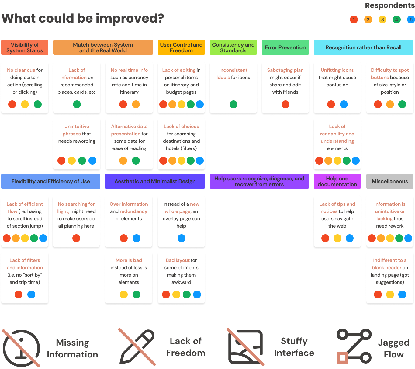
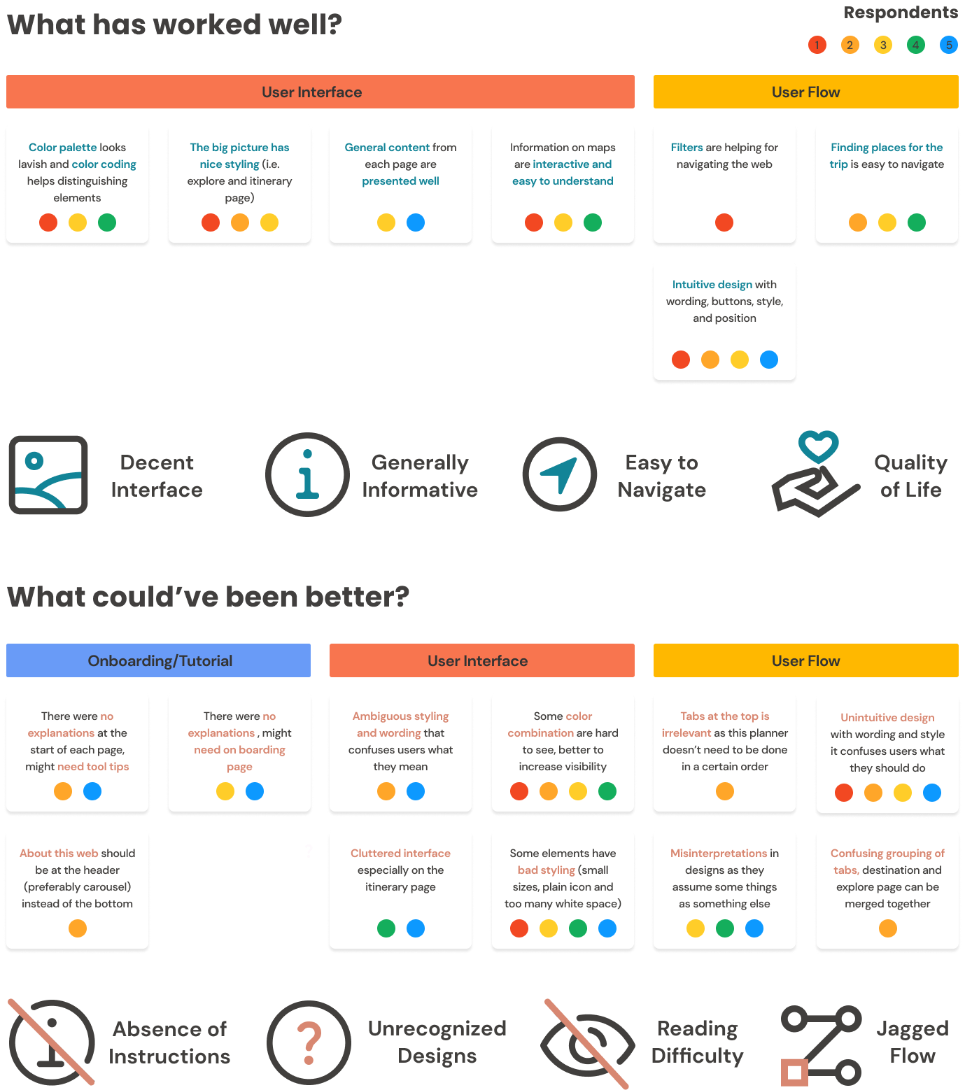
Using the 10 Usability Heuristics to analyze the result of 5 respondents who tried testing the wireframe with a scenario as such:
"You reside in Brisbane, Australia, and want to have a holiday to Indonesia and Malaysia for the Summer."
Respondents were asked to do tasks based on the scenario as below:
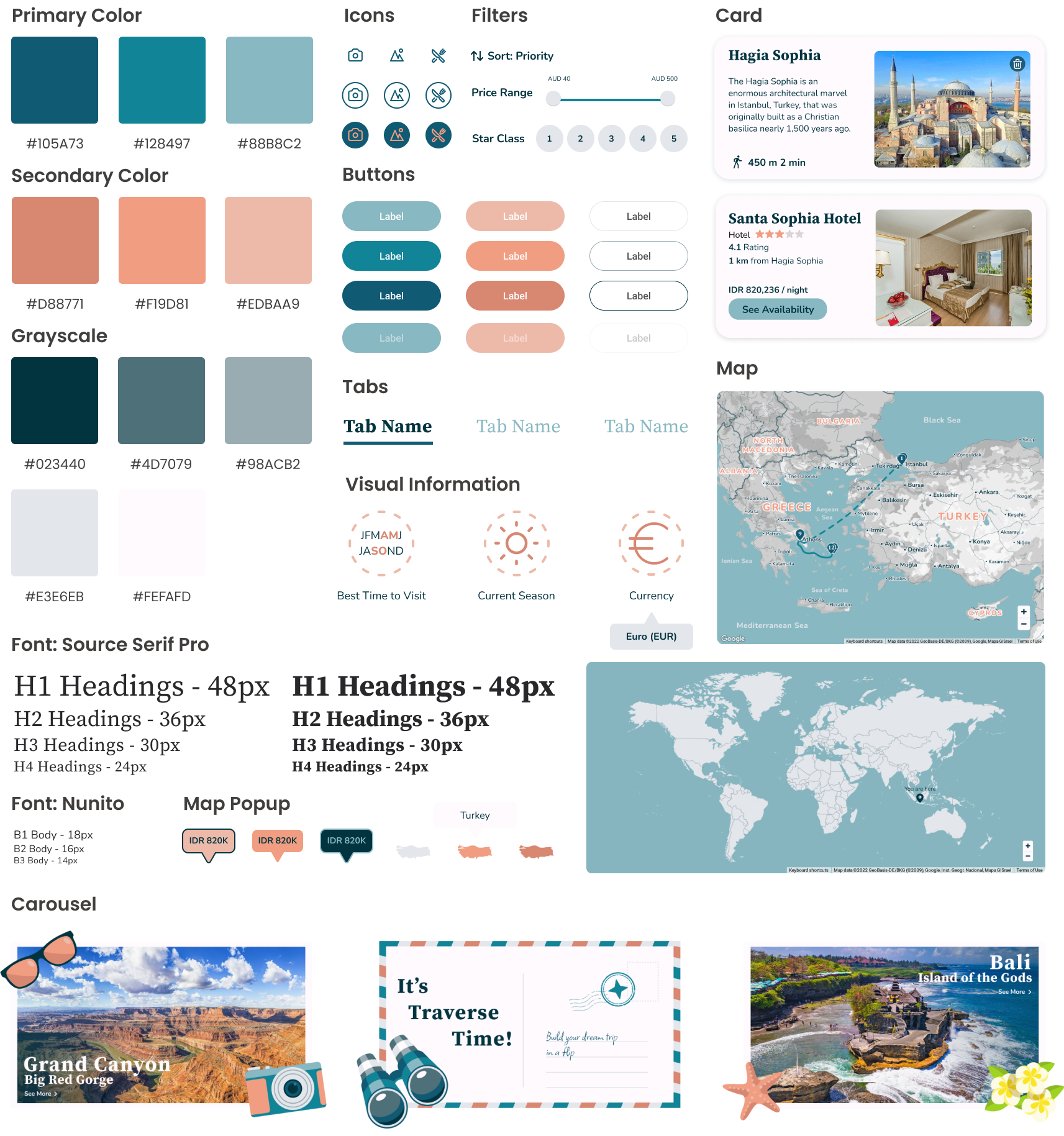
Holiday trips are more accustomed towards leisure vacation at sea, so the primary color that were chosen are the shades of cool blue with orange sandy beach as the secondary color.
Other UI elements have a more friendly style with rounded edges and lines in their design.
For validation testing, 5 respondents were helping to try the prototype out with tasks as such:
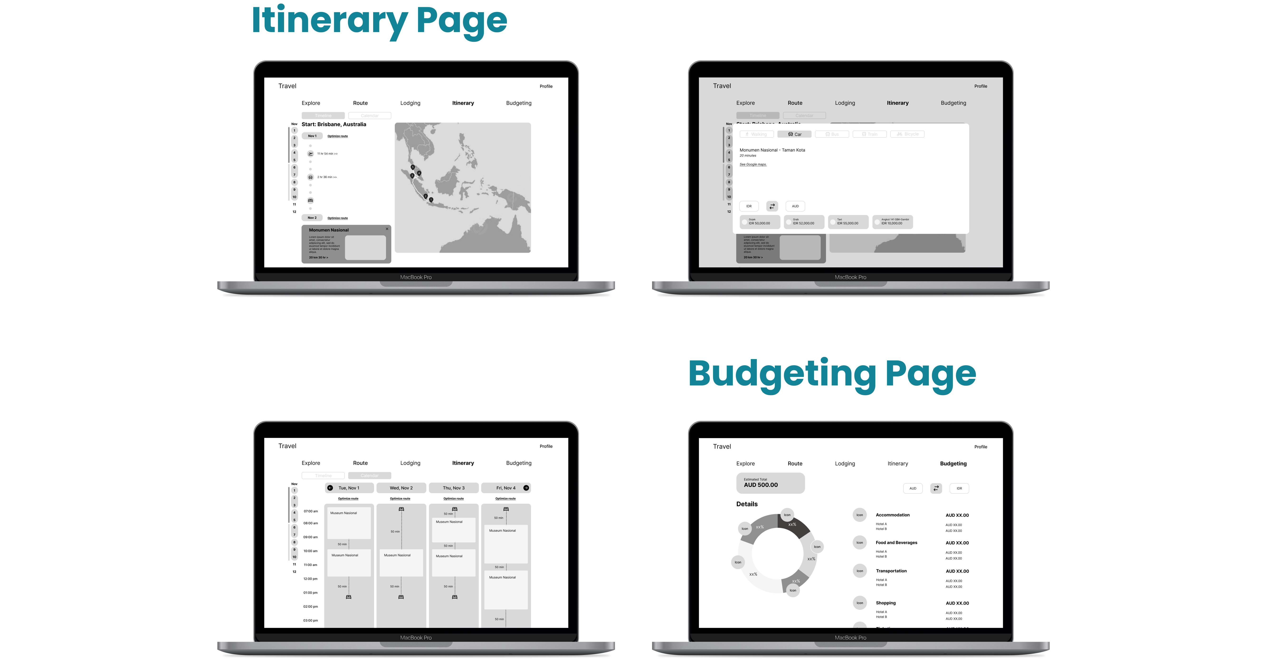
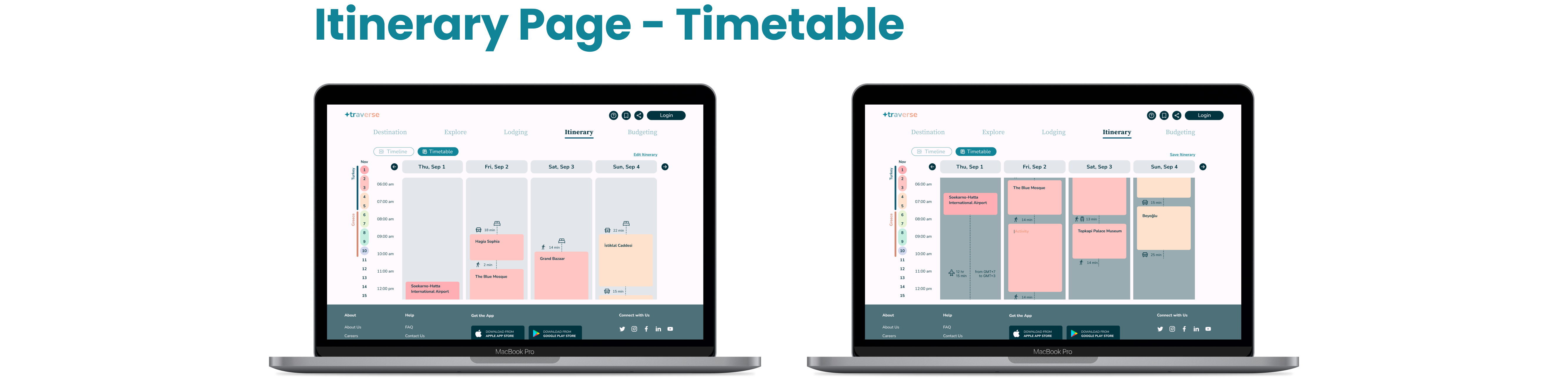
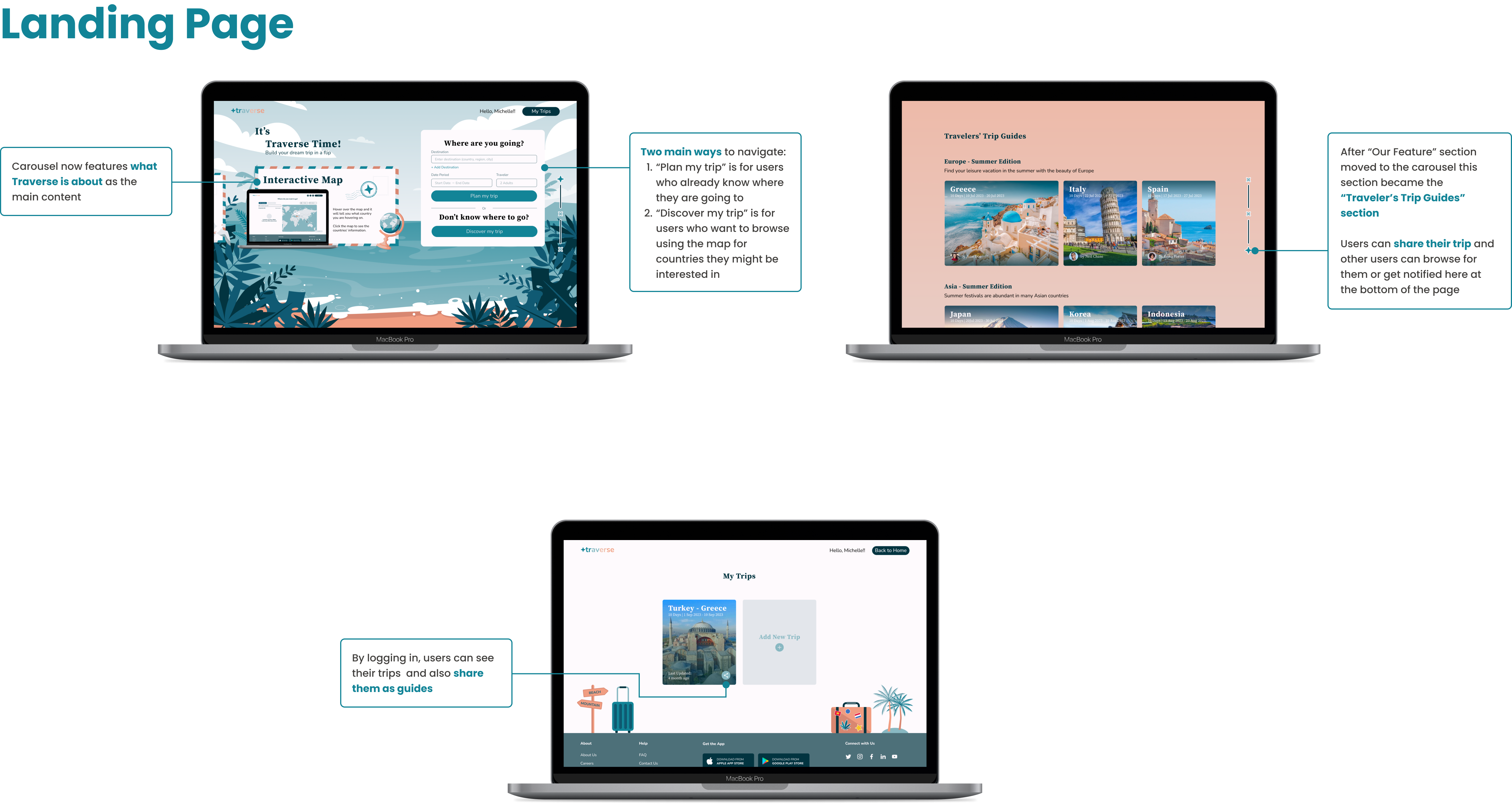
With many feedbacks from the validation test, Traverse got major and minor improvements. The major improvement is the two ways of navigation:
Minor improvements include UI features such as button, size, color stylings and minor UX features such as the addition of buttons, carousel and tool tips.
For my first web design and working on it on a team, it was actually better than working alone since each member have different views on the design and we were able to discuss and merge our ideas into a better design. Other than the delights of working on a team, there are some points that I learned from this project:
If you like what you see and want to work together, get in touch!
millenniankarinda@gmail.com